| |
LIBRARY COMMANDS |
|
| |
With SOLAR2D, you need to include Widget Candy using the require() command first. With Gideros, simply add the library file to your project. You are then ready to use the library. You'll use two types of commands: library commands and widget methods. Here's the difference:
-- -- LOAD THE LIBRARY AND USE A GLOBAL VAR TO STORE A REFERENCE:
_G.GUI = require("widget_candy")

-- THIS IS A LIBRARY COMMAND:
local MyButton = _G.GUI.GetHandle("Button1")

-- THIS IS A WIDGET METHOD:
MyButton:set("caption", "HELLO!")
• Library commands are more general commands (which means they are not tied to an individual widget). They are used to load or unload themes or delete all existing widgets, for example.
• Widget methods are bound to a single individual widget. Each widget you create features a set of methods that can be called to change its position or any of its properties.

|
|
| | | |
| |
.SetSounds() |
|
| |
While you can apply sound effects to widgets individually using a widget's .tapSound, .dragSound, .releaseSound and .changeSound properties, you can use SetSounds() to globally set (or disable) sound effects for all widgets at once. Using this command will override the individual settings of any existing widgets and set the default values for the widgets you create at a later time.
Note: If you create any widgets after calling SetSound and specify individual sound properties for a widget, the individual widget settings are used then.
| SetSounds (tapSound, releaseSound, changeSound, selectSound) |
tapSoundID
releaseSoundID
changeSoundID
selectSoundID | Sound ID to use (as defined in your theme's .lua settings file). To disable a sound, pass nil. |
|
|
| | | |
| |
.Mute() |
|
| |
Disables or enables all widget sound effects.
| Mute (state) |
| state | Specify true to disable all GUI sounds or false to enable. |
|
|
| | | |
| |
.SetLogLevel() |
|
| |
Specifies Widget Candy's console output (error messages only, error messages and info messages or no output at all). Note, that on a device environment, the logging level is ALWAYS set to level 1 (error messages are logged).
| SetLogLevel (level) |
| level | (Number)
0 = No messages are logged.
1 = Error messages only (default).
2 = All messages (error and info messages). |
|
|
| | | |
| |
.SetAudioChannel() |
|
| |
Widget Candy uses a fixed audio channel (channel #1 by default) to play widget sounds. Use SetAudioChannel( ) to change the widget sound channel to any other channel that should be used for widget sound playback.
| SetAudioChannel (channel) |
| channel | (Number)
Sound channel number to be used for widget sound playback. |
|
|
| | | |
| |
.LoadTheme() |
|
| |
Loads a new widget theme ("skin" or style) into memory. Once a theme is loaded, it can be applied to any widget to determine its look, colors etc. Each theme consists of a .lua file that is placed in your project's root and a folder (also to be placed in your project's root file). Within this folder, you can collect all graphics and sounds used for this theme.
NOTE: When using custom vector fonts in your app, please make sure that you
- • Specify the correct font name in your theme's settings .lua file.
- • With SOLAR2D SDK, specify the correct font name in your build.settings file.
- • The font must be properly installed on your machine.
- • The font should be placed within your project's root folder.
Follow these links to learn how to embed your own vector fonts using the SOLAR2D SDK:
-- REQUIRE THE LIBRARY
_G.GUI = require("widget_candy")

-- LOAD A THEME
_G.GUI.LoadTheme("theme_1", "themes/theme_1/")
| LoadTheme (themeFile, folderPath) |
| themeFile | (String) The name of the theme's .lua settings file (just the file name, without the .lua extension). To apply this theme to any widget once it has been loaded, use this name for a widget's ".theme" property. |
| folderPath | (String) The path to the theme's folder (where all graphics and sounds used for this theme are stored). Do not forget the trailing slash at the end of the path string. |
|
|
| | | |
| |
.SetThemeColor() |
|
| |
Applies a tint color to a theme. Every widget you create, as well as all existing widgets using this theme will be tinted automatically with the specified color.
Note: specifying an individual color to a widget by using the widget's color property will override the theme's tint color.
-- REQUIRE THE LIBRARY
_G.GUI = require("widget_candy")

-- LOAD A THEME
_G.GUI.LoadTheme("theme_1", "themes/theme_1/")

-- APPLY A TINT COLOR TO ALL WIDGETS USING THIS THEME:
_G.GUI.SetThemeColor("theme_1", { .78,1,1 } )
| .SetThemeColor (themeName, colorArray, excludeInputTexts) |
| themeName | (String) Unique name of a loaded theme. |
| colorArray | (Array) Array with three values (red, green, blue) each one within a range from 0 to 1. Example: {1,1,.25} |
| excludeInputTexts | (Boolean) If set to true, input text fields won't be colorized (looks more natural). |
|
|
| | | |
| |
.SetTheme() |
|
| |
Sets the GUI's default theme to be automatically applied to every new widget you create, so you don't need to specify the theme for each individual widget then. You can also use this command with the 'applyNow' flag set to true to realtime-change the theme of all existing widgets, too.
-- REQUIRE THE LIBRARY
_G.GUI = require("widget_candy")

-- LOAD A THEME
_G.GUI.LoadTheme("theme_1", "themes/theme_1/")

-- SET THIS THEME AS THE DEFAULT THEME OR ALL WIDGETS YOU CREATE:
_G.GUI.SetTheme("theme_1")
| .SetTheme (themeName, applyNow, color) |
| themeName | (String) Unique name of a loaded theme. |
| applyNow | (Boolean) True or false (default). If set to true, all existing widgets will be changed, too. |
| color | (Array) Array of three numbers (R,G,B), each one within a range from 0 to 1 to specify the theme's tinting color. Specifying an individual color to a widget by using the widget's color property will override the theme's tint color. Example: {1,.5,.5} |
|
|
| | | |
| |
.UnloadTheme() |
|
| |
Unloads a widget theme from memory and releases all related graphics and sounds from memory.
| UnloadTheme (themeName) |
| themeName | (String) The name of the theme to unload. |
|
|
| | | |
| |
.RemoveAllWidgets() |
|
| |
Removes (deletes) all existing widgets. If the "unloadThemes" parameter is set to true, all loaded themes are removed as well.
| RemoveAllWidgets (unloadThemes) |
| unloadThemes | (Boolean) If true, all loaded themes are removed as well. |
|
|
| | | |
| |
.GetHandle() |
|
| |
Each command that creates a widget returns a reference (handle) to the created widget. You can either store this handle within a variable at creation time or use the .GetHandle() command at any later time to get the handle of a certain widget.
The main purpose of the GetHandle() command is to eliminate the need to store any permanent references to your widgets. Remember, objects cannot be deleted from memory as long as a single reference to them exists, so it's a good programming style to NOT store any permanent references to your widgets, but to use the GetHandle() command any time you want to directly access a widget.
-- LOAD THE LIBRARY AND USE A GLOBAL VAR TO STORE A REFERENCE:
_G.GUI = require("widget_candy")

-- CREATE A BUTTON
_G.GUI.NewButton(
	{
	x     = 50,
	y     = 50,
	theme = "MyTheme",
	name  = "Button1",
	} )

-- GET THE HANDLE OF THIS BUTTON
local MyButton = _G.GUI.GetHandle("Button1")
MyButton:set("caption", "HELLO!")

-- OR IN SHORT:
_G.GUI.GetHandle("Button1"):set("caption", "HELLO!")
| GetHandle (widgetName) |
| widgetName | (String) The name of a widget. |
| Returns: | (Widget Handle) A handle (reference) to the specified widget. This handle can then be used to access any widget methods or properties. |
|
|
| | | |
| |
.Set() |
|
| |
Changes a widget's properties (either a single property or multiple properties at once). It's basically the same as using a widget's :set() method -whatever you prefer.
-- LOAD THE LIBRARY AND USE A GLOBAL VAR TO STORE A REFERENCE:
_G.GUI = require("widget_candy")

-- CREATE A BUTTON
_G.GUI.NewButton(
	{
	x       = 50,
	y       = 50,
	theme   = "MyTheme",
	name    = "Button1",
	caption = "HI!",
	} )

-- CHANGE THE BUTTON'S PROPERTIES:
_G.GUI.Set( "Button1", { x = 100, y = 100, caption = "HELLO!" } )
"caption", "HELLO!")
| Set (widgetName, propertyTable) |
| widgetName | (String) The name of a widget. |
| propertyTable | (Table) A table with properties (name / value pairs) to be applied to the widget. |
|
|
| | | |
| |
.Get() |
|
| |
Returns the current value of the specified widget property.
-- LOAD THE LIBRARY AND USE A GLOBAL VAR TO STORE A REFERENCE:
_G.GUI = require("widget_candy")

-- CREATE A BUTTON
_G.GUI.NewButton(
	{
	x       = 50,
	y       = 50,
	theme   = "MyTheme",
	name    = "Button1",
	caption = "HELLO!",
	} )

-- GET THE CAPTION OF THIS BUTTON
print( _G.GUI.Get("Button1", "caption") )
| GetHandle (widgetName, valueName) |
| widgetName | (String) The name of a widget. |
| valueName | (String) The valid name of a widget property ("name", "caption", "x", "y", "textAlign" etc.). |
| Returns: | (Misc) The current value of the specified widget property. |
|
|
| | | |
| |
.Show() |
|
| |
Shows or hides a widget, with or without a fade animation.
-- LOAD THE LIBRARY AND USE A GLOBAL VAR TO STORE A REFERENCE:
_G.GUI = require("widget_candy")

-- CREATE A BUTTON
_G.GUI.NewButton(
	{
	x       = 50,
	y       = 50,
	theme   = "MyTheme",
	name    = "Button1",
	caption = "HELLO!",
	} )

-- FADE-OUT AND HIDE THE BUTTON
_G.GUI.Show("Button1", false, true )
| Show (widgetName, isVisible, animated) |
| widgetName | (String) The name of a widget. |
| isVisible | (Boolean) Shows (true) or hides (false) the specified widget. |
| animated | (Boolean) If set to true, the widget will be shown or hidden smoothly (using a fade-in or fade-out animation). |
|
|
| | | |
| |
.Enable() |
|
| |
Enables or disables a widget. A disabled widget appears grayed-out and does not respond to user interactions.
| Show (widgetName, isEnabled) |
| widgetName | (String) The name of a widget. |
| isEnabled | (Boolean) Enables (true) or disables (false) the specified widget. |
|
|
| | | |
| |
.GetShape() |
|
| |
Returns the shape (x,y,width and height) of the specified widget.
| GetShape (widgetName) |
| widgetName | (String) The name of a widget. |
| Returns: | (Table) A table with the properties .x, .y, .w and .h (which is the widget's x- and y-position, its width and height). |
|
|
| | | |
| |
.GetDepth() |
|
| |
Returns the z-index (drawing order) of a widget. Widgets that are added first receive a lower z-index as widgets that are added at a later time. Widgets with a lower z-index are drawn first, which lets them appear behind any widgets that are drawn after. Widget Candy assigns a widget's z-index automatically, but you can also set a widget's z-index to any desired value by specifying its "z-index" property at creation time.
| GetDepth (widgetName) |
| widgetName | (String) The name of a widget. |
| Returns: | (Number) The z-index (drawing order) of the widget. |
|
|
| | | |
| |
.SetAllowedOrientations() |
|
| |
Tells Widget Candy what orientation modes are allowed, so it will be able to update and re-align widgets automatically whenever the screen orientation was changed. Use this command once directly after the Widget Candy require command:
-- REQUIRE THE LIBRARY
_G.GUI = require("widget_candy")

-- SET ALLOWED ORIENTATION MODES
_G.GUI.SetAllowedOrientations( {"portrait","portraitUpsideDown"} )
Any orientation modes that are NOT specified with this command will be ignored by Widget Candy.
Background: current versions of SOLAR2D have an issue with orientation changes that are not permitted in your build.settings file. If the device is rotated to an orientation that is NOT allowed by your build.settings file, SOLAR2D erroneously sets the screen width and height to the width and height of the new orientation, WITHOUT rotating the screen matrix, too. This makes your app (or Widget Candy) think that there actually was an orientation change, but this is not the case with non-supported orientations. Therefore, widgets may appear misaligned and off-center.
According to Ansca, this issue happens on the simulator only, not on the device itself.
In short: you won't need to use SetAllowedOrientations() if ALL orientation modes are allowed in your build.settings file. If you restricted the allowed orientation modes in your build.settings file, however, you should use SetAllowedOrientations to tell Widget Candy what orientation modes are allowed.
| SetAllowedOrientations (orientations) |
| orientations | (Array) list of allowed orientation names. Example: SetAllowedOrientations( {"landscapeRight","landscapeLeft"} ) |
|
|
| | | |
| |
.ShowTouches() |
|
| |
Highlights all touch events when the user touches a widget or a window (visual touch feedback). You can define the size, as well as the color of the touch effect.
Call this function once to enable the effect. It keeps enabled until you disable it again. To use the touch highlight effect, at least one theme must be loaded. You can disable the highlight effect at any time using .ShowTouches(false).
| ShowTouches (state, size, color) |
| state | (Boolean) If you pass true, touch highlight effect is enabled. Pass false to disable it again. |
| size | (Number) Size of the highlight effect, in pixels. |
| state | (color) Array of RGB values to specify the color of the highlight effect, ranging between 0 and 1. Example: {1,.5,0} |
|
|
| | | |
| |
VIRTUAL KEYBOARD |
|
| |
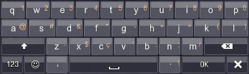
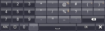 Widget Candy features a simple to use, easy to configure, yet powerful virtual keyboard, which you might want to use instead of the device's native keyboard. Widget Candy's virtual keyboard can be customized completely to your needs: you can specify your own keys, key order, key sub menus, colors, screen alignment and the height of the keyboard, for example -all with a simple function call.
GENERAL USAGE
Calling GUI.Keyboard_Show() displays the keyboard. You can pass a table of properties to customize the keyboard's look, or to link it to a Widget Candy input text, which will then automatically filled in. The basic (minimum) call to use the virtual keyboard looks like this:
-- DISPLAY THE KEYBOARD
_G.GUI.Keyboard_Show(
	{
	height  = "50%",
	target   = "MY_INPUTTEXT_NAME",
	onType   = function(EventData) print("TYPED: "..EventData.char) end,
	onOK     = function(EventData) print("INPUT FINISHED!") end,
	} )
You can call GUI.Keyboard_Show() from within your Widget Candy input text's onPress listener function, for example, to open it when the user taps the input text. Use the keyboard's .target property to link the keyboard to the input text (specify either the object handle or the input text's name). The input text will then automatically reflect all keyboard input.
Each time a char is typed, the onType listener function you defined is called and the typed char is passed as EventData.char. When the user quits the text input process (either by tapping the OK key on the keyboard, or by tapping anywhere outside the keyboard) the onOK listener function is called. You don't need to care about the keyboard input or the typed chars at all since all text input will automatically passed to your input text if you specify it as the keyboard target.
CUSTOM KEY LAYOUTS
Widget Candy's default keyboard layout should fit most situations. However, the keyboard's key layout can be individually customized, at any time. By adding only the keys you want to, you don't need to verify your input text against any unwanted chars. To use any custom key layout, simply pass an optional table named .layout with GUI.Keyboard_Show which looks like this, for example:
-- DISPLAY KEYBOARD WITH A CUSTOM LAYOUT
_G.GUI.Keyboard_Show(
	{
	height   = "50%",
	onOK     = function(EventData) print("DONE!") end,
	layout   =
		{
		-- KEY PAGE 1: EMAIL-SAFE CHARS
		page1 =
			{
			allowCase = true,
			{ {"Q","1"}, {"W","2"}, {"E","3"}, {"R","4"}, {"T","5"}, {"Y","6"}, {"U","7"}, {"I","8"}, {"O","9"}, {"P","0"} },
			{ {"A"}, {"S"}, {"D"}, {"F"}, {"G","-"}, {"H"}, {"J"}, {"K"}, {"L"} },
			{ {"SHIFT"}, {"Z","_"}, {"X"}, {"C"}, {"V"}, {"B"}, {"N"}, {"M"}, {"DEL"} },
			{ {"PAGE2"}, {"@"}, {".","_","-"}, {"OK"}, {"CLEAR"} },
			},
		-- KEY PAGE 2: NUMBERS
		page2 =
			{
			allowCase = false,
			{ {"1"}, {"2"}, {"3"}, {"0"},  },
			{ {"4"}, {"5"}, {"6"}, {"@"}, },
			{ {"7"}, {"8"}, {"9"}, {".","_","-"} },
			{ {"PAGE1"}, {"SPACE"}, {"DEL"}, {"OK"}, {"CLEAR"} },
			},
		}
	} )
You can pass up to three different key pages (f.e. chars, numbers and smileys), which should be enough for all needs. As you can see with the code above, to include the two chars keys 'A' and 'S', for example, you simple add {"A"},{"S"}... to the layout table. If you want the 'A' key to contain a sub menu with some related choices, you define this as follow: {"A","Ŕ","Á","Â"}, {"S"}... -The first element (in this case 'A' is shown as the main character, the following chars are placed in a sub menu then that pops up when the user taps and holds the 'A' key for a while.
To let the user switch from one keyboard page to another, or to delete chars or clear the input text, the following function keys can be added to the layout:
- {"PAGE1"} -Creates a key to jump to key page 1.
- {"PAGE2"} -Creates a key to jump to key page 2.
- {"PAGE3"} -Creates a key to jump to key page 3.
- {"SPACE"} -Creates a space key.
- {"DEL"} -Creates delete key.
- {"CLEAR"} -Creates a key to clear the textfield.
- {"SHIFT"} -Creates a shift key to toggle between upper / lower case.
- {"OK"} -Key to abort / finish the text input.
Also note the .allowCase = true | false property above. This specifies if the chars and symbols on a keyboard page may be toggled by using the SHIFT key or just stay as they are. If you specified a page of smileys, for example, you should set .allowCase to false, otherwise the smileys would change their case each time the user taps the SHIFT key.
NOTE: The chars in your layout definition table are always specified in UPPERCASE, except chars or smiley codes that should always stay lower case and do not change their case (.allowCase = false) by use of the SHIFT key.
CUSTOM COLORS & PROPERTIES
You can also customize any color used, as well as the keyboard sounds, key text colors and the alignment of the keyboard (screen top or screen bottom) by specifying the properties below when calling GUI.Keyboard_Show():
PROPERTIES
| Properties |
| | Use the common widget properties as described under Widget Properties. Additionally, this widget provides the following properties: |
| height | (Number / String)
The height of the keyboard, either as an absolute pixel value (number) or a percentual string value like "50%", which would be 50% of the screen's height, for example. |
| align | ("top" | "bottom")
Specifies wether the keyboard is placed on top or the bottom of screen. |
| cursor | (Char)
Specifies the char to use as a blinking cursor when the keyboard is linked to an input text. CAUTION! This char must not be used anywhere else in the input field's text (and must therefore not included on the keyboard, too). |
| target | (Object Handle / String)
Specify a Widget Candy input text handle or name here to link the keyboard to this input text. The specified input text will then reflect all keyboard input. |
| case | (0 | 1 | 2)
Defines the case to start when the keyboard opens (0 = lower case, 1 = upper case, 2 = shift lock) |
| fontSize | (Number)
The font size of the key texts on the keyboard. |
| subTextSize | (Number)
The font size of the chars placed in a key's sub menu. |
| subTextDelay | (Number)
The sub menus' pop up delay, in milliseconds. |
| glossy | (Boolean)
Displays a gloss / shine effect on the keys when true. |
| margin | (Number)
Defines the margin between the individual keys. A value between 0 and 4 is a good choice. |
| corners | (Number)
The corner radius of the individual keys. Set this to 0 for sharp key outlines or to a value of 4 or 6 to display rounded key corners. |
| bgColor | (Array)
Array of R,G,B and alpha value to define the keyboard's background color. Values must range between 0 - 1. |
| charColor1 | (Array)
Array of R,G,B and alpha value to define the text color of the key labels. Values must range between 0 - 1. |
| charColor2 | (Array)
Array of R,G,B and alpha value to define the text color of a key's sub menu texts. Values must range between 0 - 1. |
| keyColor1 | (Array)
Array of R,G,B and alpha value to define the color of a key. Values must range between 0 - 1. |
| keyColor2 | (Array)
Array of R,G,B and alpha value to define the color of the function keys (DEL, OK, SHIFT, PAGE1, PAGE2, PAGE3, CLEAR, SPACE) and the color of the number keys. Values must range between 0 - 1. |
| keyStroke | (Array)
Array of stroke width, R,G,B and alpha value to define the outline of the keys. Values must range between 0 - 1.Example: keyStroke = {2, 1,1,1, .5}, |
| pressColor | (Array)
Array of R,G,B and alpha value to define the color of a currently pressed (tapped) key. Values must range between 0 - 1. |
| tapSound | (Sound ID)
Sound ID (as defined in your theme's .lua settings file) that should be used when a key is tapped. |
| subTextSound | (Sound ID)
Sound ID (as defined in your theme's .lua settings file) that should be used when a key's sub menu opens. |
| releaseSound | (Sound ID)
Sound ID (as defined in your theme's .lua settings file) that should be used when a key is released. |
LISTENER FUNCTIONS
Along with the above properties, you can also pass some functions to be called on certain events. Those functions will receive a parameter that contains useful event data.
| Listener Functions |
| onType | (function) If you define a function named 'onType' with the keyboard's properties table, this function will be called when the user taps a keyboard key / enters a char. Your listener function then receives an event table to tell you what key was pressed: onType = function(EventData)
print(EventData.char)end The EventData's .char property either holds the character that has been entered or one of the following strings, if a 'special key' was pressed: "CLEAR" - The clear text button was pressed.
"DEL" - Delete button was pressed. |
| onOK | (function) If you define a function named 'onOK' with the widget's properties table, this function will be called when the user presses the keyboard's 'OK' button (which terminates the text input and hides the keyboard again). onOK = function( ) print("TEXT INPUT FINISHED!") end, |
|
|
| | | |
| |
.Keyboard_Show( ) |
|
| |
Displays the virtual keyboard. Pass a properties table (see 'Keyboard, Properties' above) to customize the keyboard's look and layout, or to link it to an input text.
| Keyboard_Show (Properties) |
| Properties | (Table) Table of properties (see 'Keyboard, Properties' above) to customize the keyboard's look and layout, or to link it to an input text. |
|
|
| | | |
| |
.Keyboard_Remove( ) |
|
| |
Programmatically removes the keyboard, if open.
| Keyboard_Remove (animate) |
| animate | (Boolean) If false, the keyboard will be removed immediately. If true, the keyboard slides out and is therefore removed with a delay of 200-300 milliseconds. |
|
|
| | | |
| |
.Keyboard_ChangeCase( ) |
|
| |
Programmatically changes the case of the keyboard chars.
| Keyboard_ChangeCase (case) |
| case | (0 | 1 | 2) Defines the case, where 0 = lower case, 1 = shift enabled, 2 = shift locked. |
|
|
| | | |
| |
.Keyboard_Open( ) |
|
| |
Returns true if the virtual keyboard is currently active or false, if not. Use this function when the user presses the Android back key, for example, to detect if the keyboard is currently active and needs to be removed first.
| Keyboard_Open () |
| Returns: | true | false |
|
|
| | | |
| |
WIDGETS |
|
| |
To create a widget, call the regarding command as shown below and pass a table of properties. These properties determine the look and behaviour of the widget -the widget's position, for example, the text caption, what icon to use, text align and so on. These properties are explained below. Additionally, some widgets provide a few special properties, those are explained below with the regarding widget command.
Here's an example of creating a simple button:
-- REQUIRE THE LIBRARY
_G.GUI = require("widget_candy")

-- CREATE A BUTTON
_G.GUI.NewButton(
	{
	x               = "center",
	y               = "center",
	width           = "50%",
	name            = "Button1",
	theme           = "theme_1",
	caption         = "I am a simple button.",
	textAlign       = "left",
	icon            = 9,
	includeInLayout = false,
	onPress         = function() print("PRESSED!")  end,
	onRelease       = function() print("RELEASED!") end,
	} )
WIDGET PROPERTIES
To create a button, for example, simply call the NewButton() command and pass a table of properties. These properties determine the look and behaviour of the widget -the widget's position, for example, the text caption, what icon to use, text align and so on. Most widgets share the same basic properties like "x", "y", "caption", "textAlign" etc.
PLACING WIDGETS WITHIN GROUPS
You can place a widget within any display group (or window widget) using the widget's .parentGroup property (see properties list below). You should not use SOLAR2D's :insert or methods to place widgets within a display group. Use the .parentGroup property instead.
WIDGET METHODS
All widgets provide a set of methods as shown below. These methods can be used to set or get certain properties or to show or hide a widget etc.
AUTOMATED WIDGET LAYOUT
One of the most tedious tasks while designing an interface for your app is to position and arrange all your widgets to provide a clean, tidy look. Widget Candy provides an automated widget layout system to arrange your widgets automatically for you -without specifying any widget coordinates.
This is done using window widgets (window widgets are very handy, as you will see). Widgets that are placed within a window widget are arranged automatically, if you do not specify any coordinates or set their x or y property to "auto". Widget Candy then places each widget next to the previous one. If the window's width is exceeded, a widget will be placed below the previous widgets and the window's height will be adjusted automatically. Additionally, you can also specify the spacing between widgets or if a widget should be placed on a "new line". You can even specify an absolute value for a widget's x-position, but let Widget Candy automatically calculate the y-position. It's simple and you'll get familiar with it in a very short time.
Auto-layout uses the widgets' z-order (the order they are placed inside the parent). This means that Widget Candy loops through all widgets within a display group or window widget, starting with the first one added (z-order = 1) up to the last one. You can also specify a custom z-order for any widget by specifying a .zindex property (see Widget Properties).
Note: to ensure best performance, auto-layouting is not applied automatically. You can perform automatic layouting at any time using the MyWindow:layout() method. This calculates the layout for the window's widgets once and should be used when you finished placing your widget inside a window or whenever you changed the size of a widget, for example.
GENERAL WIDGET PROPERTIES
| x | (String or Number) Specifies the horizontal position of the widget. Possible values are:
- "left"
- "right"
- "center"
- "0%" to "100%" (using quotes)
- Any integer number
Use "left", "right" and "center" to align the widget either to the left, right or middle of the widget's parent (or the screen, if the widget is not placed inside a display group or a window widget).
Use a percentage value in quotes from "0%" to "100%" to place the widget relative to its parent's width (the widget's top left corner is used to determine the position).
Use any number (without quotes) to place the widget on an absolute position.
|
| y | (String or Number) Specifies the vertical position of the widget. Possible values are:
- "top"
- "bottom"
- "center"
- "0%" to "100%" (using quotes)
- Any integer number
Use "top", "bottom" and "center" to align the widget either to the top, bottom or middle of the widget's parent (or the screen, if the widget is not placed inside a display group or a window widget).
Use a percentage value in quotes from "0%" to "100%" to place the widget relative to its parent's height (the widget's top left corner is used to determine the position).
Use any number (without quotes) to place the widget on an absolute position.
|
| width | (String or Number) Specifies the width of the widget. Possible values are:
- "0%" to "100%" (using quotes)
- Any integer number
Use a percentage value in quotes from "0%" to "100%" to specify the widget's width relative to its parent's width (which can be a display group, a window widget or the screen itself, if the widget is not placed inside a parent).
Use any number (without quotes) to specify an exact, absolute width.
|
| height | (String or Number) Specifies the height of the widget. Possible values are:
- "0%" to "100%" (using quotes)
- Any integer number
Use a percentage value in quotes from "0%" to "100%" to specify the widget's height relative to its parent's height (which can be a display group, a window widget or the screen itself, if the widget is not placed inside a parent).
Use any number (without quotes) to specify an exact, absolute height.
|
| name | (String) Any unique name for this widget (f.e. "MyButton1"). This is optional only. If not specified, Widget Candy applies a unique name automatically. Using names to identify widgets is very handy, since most Widget Candy commands require a widget's name instead of an object handle. Therefore, you are not forced to store a reference to a widget (which could cause garbage collection problems if you forget to set this reference to nil again). In short, you should prefer using widget names, not object handles. |
| parentGroup | (window name or display group handle). Not to be confused with the .group property (see below). The parentGroup property specifies the widget's parent. If set to nil or not specified, the widget will be placed directly onto the stage (the screen). If you specify a display group handle, the widget will be inserted into that display group. If a window widget's name (in quotes) is specified, the widget will be inserted into the specified window. NOTE: you should always use .parentGroup to place a widget inside a display group, not SOLAR2D's :insert methods. |
| group | (String) Use any unique name here (in quotes, for example "MyGroup1") to group several widgets together. Widgets sharing the same group name are considered to be grouped. Widget groups are used by border widgets, for example. If you specify a group name when adding a border widget, the border will be drawn around the entire widget group, not around a single widget only. |
| alpha | (Number) Specifies the initial alpha value (transparency) of the widget. Possible values are from 0.0 (transparent) to 1.0 (opaque). |
| scale | (Number) Specifies the scale (size) of the widget graphics. Note, this scales the widget's graphics only, the widget's width or height remains unchanged. This is useful for universal builds that run on iPhone and iPad, for example. By applying a different scale to a widget you are able to compensate different screen sizes. |
| zindex | (Number) Specifies the depth or z-index where this widget should be inserted at, which is useful if you want the widget to appear in front of certain other widgets, but behind certain others. Use a value of 1 to insert the widget as the first child of it's parent (it will be drawn behind all other children of the same parent then). |
| icon | (Number) Specifies the icon to be shown (if the widget provides any). Icons are displayed from an icon sheet graphic (specified in your theme's .lua file). The icon number is the frame number on the icon sheet that you want to be displayed as the widget's icon. |
| iconSize | (Number) Specifies the size of the icon, in pixels. If not specified, the default icon size as specified in the theme's .lua settings file is used. |
| enabled | (Boolean) Specifies if the widget is enabled (true) or disabled (false). Default is true. If a widget is disabled, it will not respond to user actions until it is enabled again. Disabled widgets are drawn as transparent (greyed out). |
| color | (Array) Specify an array with three values here (red, green and blue) to apply an individual color to a widget. To apply a green color to a widget, use color = {0,1,0}, for example. To reset (remove) tinting for a widget again, set color to {1,1,1}. |
| textAlign | (String) Specifies the widget's text (and icon) alignment. Possible values are "left", "center" and "right". Default is "left". |
| textColor | (Array) Specifies the widget's text color. If not specified, a theme's default text color as specified in the theme's lua file is applied. To apply a custom text color, pass an array that contains a red, green and blue amount (each within a range from 0 to 1): textColor = {1,.5,0} |
| fontSize | (Number) Specifies the widget's font size. If not specified, a theme's default font size as specified in the theme's lua file is applied. |
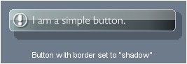
| border | (Array) Adds a background color and a border around the widget, if specified. Pass an empty table { } to remove any existing border again. The array should be in this format:
border = {type, cornerSize, strokeWidth, R1,G1,B1,A1, R2,G2,B2,A2}
- type
Possible values are "inset", "outset", "shadow" or "normal". "inset" and "outset" create an inset our outset 3D-style border, "shadow" creates a shadow behind the widget and "normal" displays a simple border only.If "shadow" is used, the parameters are different:
border = {"shadow", cornerSize, shadowOffset, shadowAlpha}, where shadowAlpha is a value from 0 (transparent) to 1 (opaque).
- cornerSize
The size of the corners' rounding. Use a value of 1 to display sharp corners.
- strokeWidth
The border's stroke width.
- R1,G1,B1,A1
The red, green, blue and alpha value used for the background color (each one from 0 - 1).
- R2,G2,B2,A2
The red, green, blue and alpha value used for the stroke color, each one from 0 - 1 (custom stroke color is only available with border type set to "normal").
|
| bgImage | (Array) Applies a custom background image to the widget, if specified. Pass an empty table { } to remove any existing background image again. The array should be in this format:
bgImage = {pathAndFileName, alpha, blendMode}
- pathAndFileName - The file name of the image to use.
- alpha - The image's alpha value (0-1)
- blendMode - F.e. "add", "multiply" etc.
|
| fadeInTime | (Number)
If specified, the widget will fade in smoothly when created. Specifies the duration of the fade in effect in millisecs. |
| tapSound | (Number) If you specify a sound ID here, this sound is played when the user taps on the widget. Sounds are specified in a theme's settings file, where the first sound specified there has the ID number 1, the second has the ID number 2 and so on. Use '0' to play no sound (when your app is muted, for example). |
| releaseSound | (Number) If you specify a sound ID here, this sound is played when the user tapped on the widget and releases his finger. Sounds are specified in a theme's settings file, where the first sound specified there has the ID number 1, the second has the ID number 2 and so on. |
| changeSound | (Number) If you specify a sound ID here, this sound is played when the widget's state or value was changed (sliders, switches etc.). Sounds are specified in a theme's settings file, where the first sound specified there has the ID number 1, the second has the ID number 2 and so on. |
| selectSound | (Number) If you specify a sound ID here, this sound is played when one of the widget's items was selected (list widget, for example). Sounds are specified in a theme's settings file, where the first sound specified there has the ID number 1, the second has the ID number 2 and so on. |
GENERAL LAYOUT PROPERTIES
| Use these widget properties to control the automatic layout of the widget: |
| includeInLayout | (Boolean) True or false. If set to true (default), this widget will be taken into account for automatic layouting. This means, the next widget that is placed within the same window will be positioned next to this widget. If set to false, this widget will be ignored by the automatic layout system. |
| newLayoutLine | (Boolean) True or false. If set to true, this widget will not placed next to the previous one, but one "line" below. It's a kind of "line break" for widget layouting. |
| rightMargin | (Number) Specifies the spacing between this widget's right border and the following widget. |
| leftMargin | (Number) Specifies the spacing between this widget's left border and the previous widget. |
| topMargin | (Number) Specifies the spacing between this widget's top border and any previous widgets. |
| bottomMargin | (Number) Specifies the spacing between this widget's bottom border and the following widgets. |
GENERAL WIDGET METHODS
| MyWidget:show ( state, fadeDuration ) |
| state | (Boolean) Shows (true) or hides (false) the widget. |
| fadeDuration | (Number) If specified, the widget will smoothly fade in or out, using the specified duration for the fade effect. |
| MyWidget:enable ( state ) |
| state | (Boolean) Enables (true) or disables (false) the widget. If disabled, the widget will appear greyed-out and does not respond to user actions. |
| MyWidget:set ( "propertyName", value, includeChildren ) |
| "propertyName" | (String) Name of a widget property (in quotes).
See Widget Properties for a list of valid widget properties. |
| value | (Any) Any value to set the specified property to. |
| includeChildren | (Boolean) If true and the widget is a container widget (a window, for example), this command will be applied to all child widgets, too. |
| Example | MyWidget:set("caption", "My new caption!") |
| MyWidget:set ( Table ) |
| Table | (Table) A widget's :set() method can also be used to change several properties at once. To do so, simply pass a table that contains any property-value pairs.
See Widget Properties for a list of valid widget properties. |
| Example | Widget:set( { caption = "My new caption!", icon = 1, textAlign = "left" } ) |
| MyWidget:get ( "propertyName" ) |
| "propertyName" | (String) Name of a widget property (in quotes) that you want to retrieve.
See Widget Properties for a list of valid widget properties. |
| Example | local txt = MyWidget:get( "caption" ) |
| MyWidget:setPos ( x, y ) |
| x | The widget's x-position. You can use either "left", "right", or "center", as well as percentage values from "0%" to "100%" (in quotes) or any number.
See here for more info on widget position values. |
| y | The widget's y-position. You can use either "top", "bottom", or "center", as well as percentage values from "0%" to "100%" (in quotes) or any number.
See here for more info on widget position values. |
| Example | MyWidget:setPos( "top", "left" ) |
| MyWidget:getShape () |
| Returns: | A table with four properties: .x, .y, .w and .h which determine the top left corner, width and height of this widget (as seen from its' parent's coordinate system). |
| Example | local Bounds = MyWidget:getShape(); print (Bounds.x) |
| MyWidget:getDepth () |
| Returns: | (Number) Returns the z-index (drawing order) of the widget. This method is useful if you want to place a widget behind or in front of another one. Widgets with lower z-indexes will be drawn behind widgets with a higher z-index. |
| Example | local zindex = MyWidget:getDepth() |
| MyWidget:toFront () |
| Brings the widget to front, so the widget will be drawn on top of all other widgets sharing the same parent. |
| MyWidget:update () |
| Updates (redraws) the entire widget. Use this method if you changed any widget property which is not reflected instantly. Using :update() is always a good idea here, but should be used wisely, because redrawing an entire widget will cost some performance, of course. |
| MyWidget:destroy () |
| Removes (deletes) a widget. Do not forget to set any stored references to this widget to nil again, otherwise the widget could not be garbage collected correctly and would still remain in memory. |
| MyWidget:makeDraggable (minX,minY, maxX,maxY) |
| Makes a widget draggable by the user within a specified bounding box (defined by minX, minY, maxX and maxY). Can be used with all widgets, except the window widget (which is already draggable). To disable drag functionality, simply call :makeDraggable(false). |
|
|
| | | |
| |
.NewWindow() |
|
| |
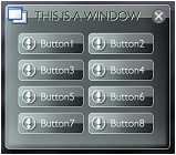 Creates a window widget. Window widgets can hold other widgets and even arrange (layout) them automatically for you. Window widgets can be dragged (horizontally, vertically, or both) within a specified drag area, which is the screen size, for example. Window widgets also provide a close button to let them disappear again.
To add any widget to a window widget, simply specify the window's unique name (in quotes) as the widget's 'parentGroup'. If a window is removed (deleted), all nested widgets are automatically deleted, too, so you don't need to remove all widgets of a window manually.
Widgets inside a window can either be positioned using absolute coordinates or positioned (arranged) automatically by calling the window's :layout() method. See Automated Widget Layout for a detailed description.
A window widget's title caption color is defined in the theme's lua file. See 'WindowCaptionColor1' and 'WindowCaptionColor2' there. You can also define some other useful window settings there like a window's font size, icon size or shadow offset, for example.
Beside tinting a window widget completely using the color property (see Widget Properties) You can also apply a colored gradient to a window's background only by specifying the properties gradientColor1, gradientColor2 and gradientDirection when creating a window (see below).
-- REQUIRE THE LIBRARY
_G.GUI = require("widget_candy")

-- CREATE THE WIDGET
_G.GUI.NewWindow(
	{
	x      = "50%",
	y      = "bottom",
	name   = "Win1",
	theme  = "MyTheme1",
	[any other properties...]
	} )
PROPERTIES
| Properties |
| | Use the common widget properties as described under Widget Properties. Additionally, this widget provides the following properties: |
| shadow | (Boolean) If set to true, a shadow will be displayed behind the window widget. A window shadow's alpha, position offset and corner radius can be defined in the theme's lua file. |
| windowAlpha | (Number 0..1)
Specifies the transparency of the window itself, not affecting any nested widgets. |
dragX
dragY | (Boolean) If dragX is set to true, the window can be dragged horizontally, if dragY is set to true, the window can be dragged vertically. |
| dragArea | ("auto" | Array) Defines the area within the window can be dragged around. If not specified, there are no drag boundaries applied. If set to "auto" (using quotes) the drag area will be automatically set to the screen dimensions (the window should not be placed within a moved or scaled display group then). If you want to define a custom drag area, pass an array with four values: dragArea = {left, top, width, height} |
| slideOut | (Number) Specify a value here from 0 to .99 to set the window's slide-out speed (the slow-down applied when the widget was dragged and then released). Use values from 0 (stop immediately) to .99 (slow slide out). |
| margin | (Number) Defines the spacing between the windows borders and the widgets placed inside. |
| closeButton | (Boolean) If set to true, a close button is shown on the window's top right corner. If tapped by the user, the window will set to be hidden only, not removed. Tapping a window's close button calls the onClose() function of a window (see below). You can put your own code into that function to execute any tasks when a window's clode button is used. |
| tapToFront | (Boolean) If set to true (default), the window will be brought to front when the window itself or any of its widgets are tapped. Set this property to false to disable this behavior. |
| height | ("auto" | Number)
Specifies the fixed height of the window. If set to "auto" (using quotes), the window height will be calculated automatically depending on the widgets placed inside. |
| minHeight | (Number)
Defines the minimum height of the window (if the 'height' property is set to "auto"). |
gradientColor1
gradientColor2
gradientDirection | Applies an additional custom color gradient to the window where colorGradient1 defines the starting color of the gradient (red, green, blue and alpha value and colorGradient2 the ending gradient color. gradientDirection defines the direction of the gradient an can be either "up", "down", "left", "right". Example:
gradientColor1 = {1,0,1, .5},
gradientColor2 = {.25,.5,1, .5},
gradientDirection = "down", |
| modal | (Boolean) If set to true, the window will behave as a modal dialog -which means that everything behind the window will be darkened and set to non-interactive until the window is removed again. Note that his only works at window creation time, you cannot set a window to modal at a later time. |
| noTitle | (Boolean)
If set to true, the window's title bar (including icon, title caption and close button) will be suppressed (hidden). |
LISTENER FUNCTIONS
Along with the above properties, you can also pass some functions to be called on certain events:
| Listener Functions |
| onPress | (function) If you define a function named 'onPress' with the widget's properties table, this function will be called when the user taps the widget or when a drag event begins. Example:
onPress = function(EventData) [ YOUR CODE HERE ] end, |
| onWidgetPress | (function) If you define a function named 'onWidgetPress' with the widget's properties table, this function will be called when the user taps a widget inside the window (not the window itself). EventData.name will hold the pressed widget's name then. |
| onDrag | (function) If you define a function named 'onDrag' with the widget's properties table, this function will be called when the user drags the window around. Example:
onDrag = function(EventData) [ YOUR CODE HERE ] end, |
| onRelease | (function) If you define a function named 'onRelease' with the widget's properties table, this function will be called when the user lifts the finger from the window or if a drag event ended. Example:
onRelease = function(EventData) [ YOUR CODE HERE ] end, |
| onClose | (function) If you define a function named 'onClose' with the widget's properties table, this function will be called when the user taps the window's close button. Example:
onClose = function(EventData) [ YOUR CODE HERE ] end, To remove (delete) a window when the user taps the close button, call EventData.Widget:destroy() within the window's onClose listener function. |
| EventData | (Table) Your defined functions will receive a table that contains useful event data. This table contains the following data:
- EventData.Widget - The widget's display object handle.
- EventData.Props - A table that contains all the widget's properties.
- EventData.name - The name of the widget (a string).
|
METHODS
Along with the common widget methods, this widget provides the following additional methods:
| MyWindow:layout ( doScreenAlign ) |
| Arranges (positions) all widgets inside this window automatically. A window's layout() method should be used whenever you added new widgets to a window (once, after all the widgets have been added) to layout all the widgets automatically inside the window and to adjust the window height according to the widgets inside (if the window height is set to "auto"). To have widgets inside a window automatically positioned, the widget's x or y property must set to "auto" and its includeInLayout property set to true. |
| doScreenAlign | (Boolean) When true, the window will be re-aligned to the screen after its widgets have been arranged. This is useful, if the window should remain centered on the screen, for example, and its height changed after arranging the widgets inside. |
| MyWindow:close () |
| Use this method to close (hide) the window programmatically. This will not remove or delete the window, it will be hidden only. |
|
|
| | | |
| |
.NewButton() |
|
| |
 Creates a button, showing an icon and text of your choice. Use the textAlign property (see Widget Properties) to display the icon to the left or right of the text, also to align the text caption.
A button's icon size is defined in the theme's lua file. See 'ButtonIconSize' there. Text buttons can be auto-sized (if there width property is set to "auto"). If so, the button will automatically sized according to the size of it's text caption.
Common buttons are of fixed height, so the height parameter has no effect on them. The height of a button is the height of a frame on the GUI sheet texture. This is to save resources and keep performance as good as possibe. The background is that a button with a fixed height uses three images only (left cap, right cap, middle segment) while a fully scalable button would use nine elements (four corners, left, right, top, bottom, middle). If you need to use fully scalable buttons, try out the Shape Button instead.
-- REQUIRE THE LIBRARY
_G.GUI = require("widget_candy")

-- CREATE THE WIDGET
_G.GUI.NewButton(
	{
	x       = 0,
	y       = 0,
	width   = "50%",
	name    = "MyButton",
	theme   = "MyTheme1",
	icon    = 2,
	caption = "Touch me!",
	onPress = function( EventData ) print("I WAS PRESSED!") end,
	[any other properties...]
	} )
PROPERTIES
| Properties |
| | Use the common widget properties as described under Widget Properties. Additionally, this widget provides the following properties: |
| toggleButton | (Boolean) If set to true, this button will behave as a "toggle button", which means that it will stay latched until it is tapped again. The toggleState property (see next) indicates whether the button is currently "latched" or not. |
| toggleState | (Boolean) If toggleButton (see above) is set to true, this property can be used to set or read the button's current state (latched or not). |
| toggleGroup | (String) Specify a unique toggle group name (string) to 'group' several toggle buttons, like radio buttons. If several toggle buttons are sharing the same toggle group name and you tapped on of them, all others are set to 'unlatched' automatically. |
| disableOffset | (Boolean) By default, a button's icon and text are shifted a few pixels when pressed, to provide optical feedback to the user. If you do not want this, set this property to true to disable it, the button's icon and caption remain static then. |
| flipIconX | (Boolean) Flips the button's icon horizontally when set to true. |
| flipIconY | (Boolean) Flips the button's icon vertically when set to true. |
| iconAlign | (String) Specifies the widget's icon position ("left", "center" or "right"). |
LISTENER FUNCTIONS
Along with the above properties, you can also pass some functions to be called on certain events. Those functions will receive a parameter that contains useful event data.
| Listener Functions |
| onPress | (function) If you define a function named 'onPress' with the widget's properties table, this function will be called when the user taps the widget or when a drag event begins. Please note that a toggle button's toggleState will be updated with the onRelease event, not the onPress event, so use the onRelease event to ask for a toggle button's current state. Example:
onPress = function( EventData ) [ YOUR CODE HERE ] end, |
| onRelease | (function) If you define a function named 'onRelease' with the widget's properties table, this function will be called when the user lifts the finger from the window or if a drag event ended. Read the EventData.inside property to find out if the finger was lifted inside or outside of the widget. Example:
onRelease = function( EventData ) [ YOUR CODE HERE ] end, |
| EventData | (Table) Your onPress and onRelease functions will receive a table that contains useful event data. This table contains the following data:
- EventData.Widget - The widget's display object handle.
- EventData.Props - A table that contains all the widget's properties.
- EventData.name - The name of the widget (a string).
- EventData.inside - True if the user lifted the finger inside the widget (released inside), false if the finger was lifted outside the widget (released outside). To be used in your onRelease listener function.
- EventData.eventName - The event's name.
- EventData.eventID - The event's id.
|
|
|
| | | |
| |
.NewSquareButton() |
|
| |
 Creates a squared button, showing an icon only (no text). Because squared buttons are always of the same size and do not contain text, there is no need to set it's width, height, caption or textAlign properties.
-- REQUIRE THE LIBRARY
_G.GUI = require("widget_candy")

-- CREATE THE WIDGET
_G.GUI.NewSquareButton(
	{
	x       = 0,
	y       = 0,
	name    = "MyWidget",
	theme   = "MyTheme1",
	icon    = 3,
	onPress = function( EventData ) print("I WAS PRESSED!") end,
	[any other properties...]
	} )
PROPERTIES
| Properties |
| | Use the common widget properties as described under Widget Properties. Additionally, this widget provides the following properties: |
| toggleButton | (Boolean) If set to true, this button will behave as a "toggle button", which means that it will stay latched until it is tapped again. The toggleState property (see next) indicates whether the button is currently "latched" or not. |
| toggleState | (Boolean) If toggleButton (see above) is set to true, this property can be used to set or read the button's current state (latched or not). |
| toggleGroup | (String) Specify a unique toggle group name (string) to 'group' several toggle buttons, like radio buttons. If several toggle buttons are sharing the same toggle group name and you tapped on of them, all others are set to 'unlatched' automatically. |
| disableOffset | (Boolean) By default, a button's icon and text are shifted a few pixels when pressed, to provide optical feedback to the user. If you do not want this, set this property to true to disable it, the button's icon and caption remain static then. |
| flipIconX | (Boolean) Flips the button's icon horizontally when set to true. |
| flipIconY | (Boolean) Flips the button's icon vertically when set to true. |
LISTENER FUNCTIONS
Along with the above properties, you can also pass some functions to be called on certain events. Those functions will receive a parameter that contains useful event data.
| Listener Functions |
| onPress | (function) If you define a function named 'onPress' with the widget's properties table, this function will be called when the user taps the widget or when a drag event begins. Please note that a toggle button's toggleState will be updated with the onRelease event, not the onPress event, so use the onRelease event to ask for a toggle button's current state. Example:
onPress = function( EventData ) [ YOUR CODE HERE ] end, |
| onRelease | (function) If you define a function named 'onRelease' with the widget's properties table, this function will be called when the user lifts the finger from the window or if a drag event ended. Read the EventData.inside property to find out if the finger was lifted inside or outside of the widget. Example:
onRelease = function( EventData ) [ YOUR CODE HERE ] end, |
| EventData | (Table) Your onPress and onRelease functions will receive a table that contains useful event data. This table contains the following data:
- EventData.Widget - The widget's display object handle.
- EventData.Props - A table that contains all the widget's properties.
- EventData.name - The name of the widget (a string).
- EventData.inside - True if the user lifted the finger inside the widget (released inside), false if the finger was lifted outside the widget (released outside). To be used in your onRelease listener function.
- EventData.eventName - The event's name.
- EventData.eventID - The event's id.
|
|
|
| | | |
| |
.NewShapeButton() |
|
| |
 Creates a button of any size, showing an icon and text or image of your choice. Use the textAlign property (see Widget Properties) to display the icon to the left or right of the text, also to align the text caption.
Shape buttons do not use your GUI sheet graphics and are made of shapes only. Therefore, they are not limited to a certain height and can be set to any size.
If no caption is specified, the icon will be stretched to fill the entire button, otherwise it will be placed next to the text caption. If a custom image is used instead of a button, the image will always stretched to fill the entire button size.
The buttons fill and border color is specified by the .border property (see Widget Properties). To specify a custom color while the button is touched or in toggled state, use the .pressColor property which awaits an array of four numbers from 0-1 and define the red, green, blue and alpha value when the button is currently touched or in toggled state.
Buttons with caption can be auto-sized (if there width property is set to "auto"). If so, the button will automatically sized according to the size of it's text caption.
-- REQUIRE THE LIBRARY
_G.GUI = require("widget_candy")

-- CREATE THE WIDGET
_G.GUI.NewShapeButton(
	{
	x          = 0,
	y          = 0,
	width      = 200,
	height     = 100,
	name       = "MyButton",
	theme      = "MyTheme1",
	border     = {"normal",6,1, .12,.12,0,.4,  .72,.72,.72,.6},
	pressColor = {1,1,1,.25},
	icon       = 2,
	caption    = "Touch me!",
	onPress    = function( EventData ) print("I WAS PRESSED!") end,
	[any other properties...]
	} )
PROPERTIES
| Properties |
| | Use the common widget properties as described under Widget Properties. Additionally, this widget provides the following properties: |
| toggleButton | (Boolean) If set to true, this button will behave as a "toggle button", which means that it will stay latched until it is tapped again. The toggleState property (see next) indicates whether the button is currently "latched" or not. |
| toggleState | (Boolean) If toggleButton (see above) is set to true, this property can be used to set or read the button's current state (latched or not). |
| toggleGroup | (String) Specify a unique toggle group name (string) to 'group' several toggle buttons, like radio buttons. If several toggle buttons are sharing the same toggle group name and you tapped on of them, all others are set to 'unlatched' automatically. |
| disableOffset | (Boolean) By default, a button's icon and text are shifted a few pixels when pressed, to provide optical feedback to the user. If you do not want this, set this property to true to disable it, the button's icon and caption remain static then. |
| pressColor | (Array) Array of four numbers (0-1) to define the red, green, blue and alpha value of the button's color when touched by the user of when in toggled state. |
| image | (String) File name of a custom image file to load and display with the button. |
| imageFilter | (Boolean) Gideros only. If a custom image is used, set this property to true to enable anti-aliasing for this image (default), false to disable filtering. |
| imageOptions | (Table) Gideros only. If a custom image is used, specify texture options for the custom image here. Example: imageOptions = {wrap = Texture.REPEAT, transparentColor = 0xff00ff} |
| baseDir | (String)Base directory of the image file to load and display with this button. Possible values are system.ResourceDirectory, system.DocumentsDirectory etc. Default is your app's resource directory (where your main.lua resides). |
| flipIconX | (Boolean) Flips the button's icon (or image) horizontally when set to true. |
| flipIconY | (Boolean) Flips the button's icon (or image) vertically when set to true. |
| shineAlpha | (0.0 - 1.0) Specifies the transparency of the shape button's 'gloss effect'. Value may range from 0.0 (transparent, invisible) to 1.0 (opaque). |
LISTENER FUNCTIONS
Along with the above properties, you can also pass some functions to be called on certain events. Those functions will receive a parameter that contains useful event data.
| Listener Functions |
| onPress | (function) If you define a function named 'onPress' with the widget's properties table, this function will be called when the user taps the widget or when a drag event begins. Please note that a toggle button's toggleState will be updated with the onRelease event, not the onPress event, so use the onRelease event to ask for a toggle button's current state. Example:
onPress = function( EventData ) [ YOUR CODE HERE ] end, |
| onRelease | (function) If you define a function named 'onRelease' with the widget's properties table, this function will be called when the user lifts the finger from the window or if a drag event ended. Read the EventData.inside property to find out if the finger was lifted inside or outside of the widget. Example:
onRelease = function( EventData ) [ YOUR CODE HERE ] end, |
| EventData | (Table) Your onPress and onRelease functions will receive a table that contains useful event data. This table contains the following data:
- EventData.Widget - The widget's display object handle.
- EventData.Props - A table that contains all the widget's properties.
- EventData.name - The name of the widget (a string).
- EventData.inside - True if the user lifted the finger inside the widget (released inside), false if the finger was lifted outside the widget (released outside). To be used in your onRelease listener function.
- EventData.eventName - The event's name.
- EventData.eventID - The event's id.
|
|
|
| | | |
| |
.NewDragButton() |
|
| |
 Creates a drag button, which is a squared button that shows an up and a down arrow. Press and drag the button upwards or downwards to increase or decrease it's value. Because squared buttons are always of the same size and do not contain text, there is no need to set it's width, height, caption or textAlign properties. While the button is dragged, a bubble appears, showing it's current value. Use the textColor and fontSize properties of the button to set the color and size of the bubble text.
Drag buttons are a handy input method for numbers, because they do not waste much space on screen and there is no need for the user to fiddle around with the on-screen keyboard.
The initial value, as well as the minimum and maximum allowed values of the drag button are set using the properties 'value', 'minValue' and 'maxValue'. Along with the button's properties, you can define a function named 'onChange', which is called when the button is dragged by the user and it's value changed.
-- REQUIRE THE LIBRARY
_G.GUI = require("widget_candy")

-- CREATE THE WIDGET
_G.GUI.NewDragButton(
	{
	x        = 0,
	y        = 0,
	name     = "MyWidget",
	theme    = "MyTheme1",
	minValue = 1,
	maxValue = 20,
	value    = 10,
	onChange = function( EventData ) print(EventData.value) end,
	[any other properties...]
	} )
PROPERTIES
| Properties |
| | Use the common widget properties as described under Widget Properties. Additionally, this widget provides the following properties: |
| value | (Number) The initial (and current) value of the button. |
| minValue | (Number) Use this property to define the minimum allowed value of the button. |
| maxValue | (Number) Use this property to define the maximum allowed value of the button. |
| step | (Number) The step (amount) at which the value increases or decreases. |
| sensitivity | (Number) The speed or sensitivity at which the value increases or decreases. As higher this value as faster the value change. Default value is 0.05. Good values are from 0.02 (low sensitivity) to 0.1 (high sensitivity). |
| hideBubble | (Boolean) If set to true, no text bubble is shown when being dragged. |
LISTENER FUNCTIONS
Along with the above properties, you can also pass some functions to be called on certain events. Those functions will receive a parameter that contains useful event data.
| Listener Functions |
| onPress | (function) If you define a function named 'onPress' with the widget's properties table, this function will be called when the user taps the widget or when a drag event begins. Example:
onPress = function( EventData ) [ YOUR CODE HERE ] end, |
| onRelease | (function) If you define a function named 'onRelease' with the widget's properties table, this function will be called when the user lifts the finger from the window or if a drag event ended. Read the EventData.inside property to find out if the finger was lifted inside or outside of the widget. Example:
onRelease = function( EventData ) [ YOUR CODE HERE ] end, |
| onChange | (function) If you define a function named 'onChange' with the widget's properties table, this function will be called when the user drags the widget and it's value changed. Read the EventData.value property to get the current value of the button. Example:
onChange = function( EventData ) [ YOUR CODE HERE ] end, |
| EventData | (Table) Your onPress and onRelease functions will receive a table that contains useful event data. This table contains the following data:
- EventData.Widget - The widget's display object handle.
- EventData.Props - A table that contains all the widget's properties.
- EventData.name - The name of the widget (a string).
- EventData.value - The button's current value.
|
|
|
| | | |
| |
.NewCheckbox() |
|
| |
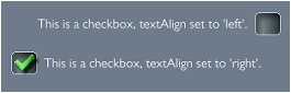 A checkbox features a text caption as well as a checkbox image that either displays a checked or unchecked state. Use the textAlign property to position the text caption either to the left or right. Use the toggleState property to set or read the current state of the checkbox.
-- REQUIRE THE LIBRARY
_G.GUI = require("widget_candy")

-- CREATE THE WIDGET
_G.GUI.NewCheckbox(
	{
	x           = "center",
	y           = "center",
	name        = "MyWidget",
	theme       = "MyTheme1",
	width       = 250,
	caption     = "Check this!",
	textAlign   = "left",
	toggleState = true, -- INITIALLY CHECKED
	onPress     = function( EventData ) print(EventData.toggleState) end,
	[any other properties...]
	} )
PROPERTIES
| Properties |
| | Use the common widget properties as described under Widget Properties. Additionally, this widget provides the following properties: |
| toggleState | (Number) If this property is set to true at creation time, the checkbox will appear checked, otherwise unchecked. You can set or read this property at any time (or within the onPress listener function) to get or set the checkbox state. |
LISTENER FUNCTIONS
Along with the above properties, you can also pass some functions to be called on certain events. Those functions will receive a parameter that contains useful event data.
| Listener Functions |
| onPress | (function) If you define a function named 'onPress' with the widget's properties table, this function will be called when the user taps the widget or when a drag event begins. Example:
onPress = function( EventData ) [ YOUR CODE HERE ] end, |
| onRelease | (function) If you define a function named 'onRelease' with the widget's properties table, this function will be called when the user lifts the finger from the window or if a drag event ended. Read the EventData.inside property to find out if the finger was lifted inside or outside of the widget. Example:
onRelease = function( EventData ) [ YOUR CODE HERE ] end, |
| EventData | (Table) Your onPress and onRelease functions will receive a table that contains useful event data. This table contains the following data:
- EventData.Widget - The widget's display object handle.
- EventData.Props - A table that contains all the widget's properties.
- EventData.name - The name of the widget (a string).
- EventData.inside - True if finger was released inside the widget or false.
- EventData.toggleState - The current state of the checkbox.
- EventData.eventName - The event's name.
- EventData.eventID - The event's id.
|
|
|
| | | |
| |
.NewRadiobutton() |
|
| |
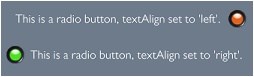 A radio button is very similar to a checkbox (see above), except that you can group several radio buttons together (by applying the same toggleGroup name, see 'toggleGroup'. When two or more radio buttons share the same toggleGroup name, only one of these buttons can be checked, the others are automatically set to an unchecked state then.
-- REQUIRE THE LIBRARY
_G.GUI = require("widget_candy")

-- CREATE THE WIDGET
_G.GUI.NewRadiobutton(
	{
	x           = "center",
	y           = "center",
	name        = "MyWidget",
	theme       = "MyTheme1",
	width       = 250,
	caption     = "I am a radio button.",
	textAlign   = "left",
	toggleGroup = "RadioGroup1",
	toggleState = true, -- INITIALLY CHECKED
	onPress     = function( EventData ) print(EventData.toggleState) end,
	[any other properties...]
	} )
PROPERTIES
| Properties |
| | Use the common widget properties as described under Widget Properties. Additionally, this widget provides the following properties: |
| toggleGroup | (String) When two or more radio buttons share the same toggleGroup name (use any unique name here, in quotes), only one of these buttons can be checked, the others are automatically set to an unchecked state then. |
| toggleState | (Number) If this property is set to true at creation time, the radio button will appear checked, otherwise unchecked. You can set or read this property at any time (or within the onPress listener function) to get or set the radio button state. |
LISTENER FUNCTIONS
Along with the above properties, you can also pass some functions to be called on certain events. Those functions will receive a parameter that contains useful event data.
| Listener Functions |
| onPress | (function) If you define a function named 'onPress' with the widget's properties table, this function will be called when the user taps the widget or when a drag event begins. Example:
onPress = function( EventData ) [ YOUR CODE HERE ] end, |
| onRelease | (function) If you define a function named 'onRelease' with the widget's properties table, this function will be called when the user lifts the finger from the window or if a drag event ended. Read the EventData.inside property to find out if the finger was lifted inside or outside of the widget. Example:
onRelease = function( EventData ) [ YOUR CODE HERE ] end, |
| EventData | (Table) Your onPress and onRelease functions will receive a table that contains useful event data. This table contains the following data:
- EventData.Widget - The widget's display object handle.
- EventData.Props - A table that contains all the widget's properties.
- EventData.name - The name of the widget (a string).
- EventData.inside - True if finger was released inside the widget or false.
- EventData.toggleState - The current state of the radio button.
- EventData.eventName - The event's name.
- EventData.eventID - The event's id.
|
|
|
| | | |
| |
.NewLabel() |
|
| |
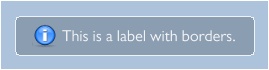 Labels are simple, one-lined texts with or without an icon. Use the textAlign property to align a label's text ("left", "right" or "center") and the textColor property to apply any color to the label's text. As with all other widgets, you can also add a border or a custom background color by specifying the label's border property (see Widget Properties).
-- REQUIRE THE LIBRARY
_G.GUI = require("widget_candy")

-- CREATE THE WIDGET
_G.GUI.NewLabel(
	{
	x           = "center",
	y           = "center",
	name        = "MyWidget",
	theme       = "MyTheme1",
	width       = "75%",
	caption     = "Here goes some text...",
	textAlign   = "left",
	icon        = 7,
	[any other properties...]
	} )
PROPERTIES
| Properties |
| | Use the common widget properties as described under Widget Properties. Additionally, this widget provides the following properties: |
| iconAlign | (String) Specifies the widget's icon position ("left", "center" or "right"). |
LISTENER FUNCTIONS
This widget does not call any listener functions.
METHODS
Along with the common widget methods, this widget provides the following additional methods:
| MyLabel:setText (anyText) |
| Update's the label's text caption. |
| MyLabel:getText () |
| Returns the label's current text caption. |
|
|
| | | |
| |
.NewText() |
|
| |
 The text widget can be used to display automatically wrapped multiline texts. Use the textAlign property to set the text align (left, center or right). You can add a colored background and a border using the border property or set the text color and text size using the textColor and fontSize properties -see Widget Properties.
If the height property is set to a certain height, the text will be cropped if this height is exceeded. Set the text widget's height property to "auto" to let the text resize automatically, according to the amount of text.
Use the pipe char ( | ) to add line breaks anywhere in your texts.
Note: If your text is placed in a window and has its height property set to "auto", you should not set the window's height property to "auto" as well. Either the parent window or the text should have a fixed height, otherwise one will try to change the other, causing unwanted side effects.
.NewTextSimple()
Widget Candy version 1.0.85 and above also contains a simplified version of the NewText widget which is a lot faster, but therefore supports basic text wrapping only (only left-aligned text, no centered or right-aligned text). Beside of that, NewText and NewTextSimple can be used identically. Note, that the maximum height of a NewTextSimple text box is the device's maximum texture height.
-- REQUIRE THE LIBRARY
_G.GUI = require("widget_candy")

-- CREATE THE WIDGET
_G.GUI.NewText(
	{
	x           = "center",
	y           = "center",
	name        = "MyWidget",
	theme       = "MyTheme1",
	width       = "75%",
	height      = "auto",
	caption     = "Here goes some text...",
	textAlign   = "left",
	[any other properties...]
	} )
PROPERTIES
| Properties |
| | Use the common widget properties as described under Widget Properties. Additionally, this widget provides the following properties: |
| lineSpacing | (Number) Additional line spacing to be applied between the text lines. Use positive numbers to increase line spacing, negative to decrease. |
LISTENER FUNCTIONS
This widget does not call any listener functions.
|
|
| | | |
| |
.NewInput() |
|
| |
 Input text fields enable the user to input any kind of text, either using a native input text and the device's native keyboard when tapped, or by using Widget Candy's virtual keyboard.
If the user taps an input text, a native input and the device's native keyboard are shown by default to receive the text input. If you want to use a custom input method (your own native input field or Widget Candy's virtual keyboard), set the .disableInput property of the input text widget to true and use it's onPress listener function to either show the virtual keyboard or any custom input method.
The input widget also provides two function listeners (functions defined by your own to be called on certain events): onChange() and onBlur(). The onChange() event ist called each time the user adds or deletes a char, the onBlur() function is called when the user taps on the screen to finish text input. As with most widgets, you can add a colored background and a border using the border property or set the text color and text size using the textColor and fontSize properties -see Widget Properties.
-- REQUIRE THE LIBRARY
_G.GUI = require("widget_candy")

-- CREATE THE WIDGET
_G.GUI.NewInput(
	{
	x               = "center",
	y               = "center",
	width           = "70%",
	theme           = "MyTheme1",
	name            = "MyWidget",
	caption         = "Enter Your Name...",
	notEmpty        = true,
	textColor       = {20,40,20},
	inputType       = "default", -- "number" | "password" | "default"
	allowedChars    = "ABCabc1234567890.!?",
	quitCaption     = "Tap screen to finish text input.",
	onChange        = function(EventData) print(EventData.value) end,
	onBlur          = function(EventData) print(EventData.value) end,
	[any other properties...]
	} )
PROPERTIES
| Properties |
| | Use the common widget properties as described under Widget Properties. Additionally, this widget provides the following properties: |
| notEmpty | (Boolean) If true, the input text's caption switches back to the original text if the user quits the text input with an empty field that contains no text at all. |
| isSecure | (Boolean) If set to true, the text will be displayed masked (for passwords etc.) |
| inputType | (String) Defines the type of the native keyboard on the device, which is shown when the input field is tapped. Can be "default", "number", "phone", "url" or "email". "default" brings up the normal keyboard, "number" will show the number keyboard on the device and so on. |
| allowedChars | (String) A string that contains all chars and numbers that should be accepted by the input text field (make sure the chars you specify here are included in your font). |
| quitCaption | (String) The caption shown on the screen informing the user that the text input can be aborted by tapping anywhere on screen. |
| disableInput | (Boolean) If set to 'true', no native input text field will pop up and only the widgets onPress listener will be available. Use this if you would like to use your own text input methods instead of Widget Candy's built-in text input. |
LISTENER FUNCTIONS
Along with the above properties, you can also pass some functions to be called on certain events. Those functions will receive a parameter that contains useful event data.
| Listener Functions |
| onFocus | (function) If you define a function named 'onFocus' with the widget's properties table, this function will be called when the input process just started. Example:
onFocus = function( EventData ) [ YOUR CODE HERE ] end, |
| onChange | (function) If you define a function named 'onChange' with the widget's properties table, this function will be called each time the user adds or deletes a char from the input text field. Example:
onChange = function( EventData ) [ YOUR CODE HERE ] end, |
| onBlur | (function) If you define a function named 'onBlur' with the widget's properties table, this function will be called when the user quits the text input mode by tapping anywhere on the screen. Example:
onBlur = function( EventData ) [ YOUR CODE HERE ] end, |
| onPress | (function) Will be called when the user taps on the text field. Use this listener function if the input text's disableInput property is set to true (which will disable Widget Candy's native text input if you would like to provide any own text input method). Example:
onPress = function( EventData ) [ YOUR CODE HERE ] end, |
| EventData | (Table) Your onChange and onBlur functions will receive a table that contains useful event data. This table contains the following data:
- EventData.Widget - The widget's display object handle.
- EventData.Props - A table that contains all the widget's properties.
- EventData.name - The name of the widget (a string).
- EventData.value - The current text of the input text field.
|
METHODS
Along with the common widget methods, this widget provides the following additional methods:
| MyInputText:setText (anyText) |
| Writes a text to the input textfield. |
| MyInputText:getText () |
| Gets the current text of the input textfield. |
|
|
| | | |
| |
.NewProgBar() |
|
| |
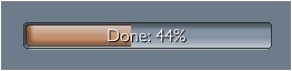 Creates a progress bar widget. Progress bars can be used as progress indicators, but also to let the user adjust some value. If a progress bar's 'allowDrag' property is set to true, the widget can be changed interactively by the user.
Use the 'value' property to set or get a progress bar's current value, which may range from 0.0 to 1.0
Along with the properties, you can also pass a function called 'textFormatter'. This function will be called whenever the progress bar value is changed. The value will be passed to this function then to let you format this value to any string you like and return it. The widget's text caption will use this formatted text then.
-- REQUIRE THE LIBRARY
_G.GUI = require("widget_candy")

-- CREATE THE WIDGET
_G.GUI.NewProgBar(
	{
	x             = "center",
	y             = "center",
	name          = "MyWidget",
	theme         = "MyTheme1",
	width         = 250,
	value         = 0.5,
	allowDrag     = false,
	textFormatter = function( value ) return "My Value: "..value end,
	[any other properties...]
	} )
PROPERTIES
| Properties |
| | Use the common widget properties as described under Widget Properties. Additionally, this widget provides the following properties: |
| value | (Number) Gets or sets the progress bar's current value (may range from 0.0 to 1.0). |
| allowDrag | (Boolean) If true, the progress bar can be changed by the user and therefore can be used as an input widget. If set to false, the progress bar is not interactive (value can be changed programmatically only). |
LISTENER FUNCTIONS
Along with the above properties, you can also pass some functions to be called on certain events. Those functions will receive a parameter that contains useful event data.
| Listener Functions |
| onPress | (function) If you define a function named 'onPress' with the widget's properties table, this function will be called when the user taps the widget or when a drag event begins. Example:
onPress = function( EventData ) [ YOUR CODE HERE ] end, |
| onDrag | (function) If you define a function named 'onDrag' with the widget's properties table, this function will be called repeatedly while the user drags the widget. Example:
onDrag = function( EventData ) [ YOUR CODE HERE ] end, |
| onRelease | (function) If you define a function named 'onRelease' with the widget's properties table, this function will be called when the user lifts the finger from the window or if a drag event ended. Read the EventData.inside property to find out if the finger was lifted inside or outside of the widget. Example:
onRelease = function( EventData ) [ YOUR CODE HERE ] end, |
| textFormatter | (function) If you define a function named 'textFormatter', this function will receive the value when changed. You can format this value to any string you like and return it to let the widget's caption display the formatted value. Example:
textFormatter = function( value ) return "My value: "..value end, |
| EventData | (Table) Your onPress and onRelease functions will receive a table that contains useful event data. This table contains the following data:
- EventData.Widget - The widget's display object handle.
- EventData.Props - A table that contains all the widget's properties.
- EventData.name - The name of the widget (a string).
- EventData.inside - True if finger was released inside the widget or false.
- EventData.value - The current value of the progress bar (0.0 - 1.0).
- EventData.eventName - The event's name.
- EventData.eventID - The event's id.
|
|
|
| | | |
| |
.NewBorder() |
|
| |
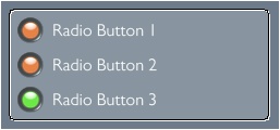 A border widget adds a colored background and a border around a group of widgets. Widgets whose 'group' property has been set to the same name are considered as grouped. When you apply the same group name to a border widget then, the border will automatically enclose all widgets of that group.
The visual appearance of the border is defined by the 'border' property of the border widget. You can set the type of the border ("normal", "inset", "outset", "shadow"), as well as the corner radius, stroke width and stroke color.
If you changed the size or position of an enclosed widget, you can call the border's :update() method to have the border widget updated, too.
Note: a border widget is useful to enclose a group of widgets. If you want to display a border around a single widget only, use the widget's 'border' property (see "Widget Properties" above).
-- REQUIRE THE LIBRARY
_G.GUI = require("widget_candy")

-- CREATE THE WIDGET
_G.GUI.NewBorder(
	{
	x             = "center",
	y             = "center",
	name          = "MyBorder",
	theme         = "MyTheme1",
	group         = "MyWidgetGroup",
	border        = {"inset",4,1, .7,1,.7, .25},
	[any other properties...]
	} )
PROPERTIES
| Properties |
| | Use the common widget properties as described under Widget Properties. To define the look of the border, use the 'border' property (also explained under "Widget Properties"). |
LISTENER FUNCTIONS
This widget does not call any listener functions.
|
|
| | | |
| |
.NewSwitch() |
|
| |
 A switch is similar to a checkbox and can either show an on or off state. Use the textAlign property to position the text caption either to the left or right. Use the toggleState property to set or read the current state of the switch.
-- REQUIRE THE LIBRARY
_G.GUI = require("widget_candy")

-- CREATE THE WIDGET
_G.GUI.NewSwitch(
	{
	x           = "center",
	y           = "center",
	name        = "MyWidget",
	theme       = "MyTheme1",
	width       = 250,
	caption     = "I am a switch.",
	textAlign   = "left",
	toggleState = true, -- INITIALLY ON
	onChange    = function( EventData ) print(EventData.toggleState) end,
	[any other properties...]
	} )
PROPERTIES
| Properties |
| | Use the common widget properties as described under Widget Properties. Additionally, this widget provides the following properties: |
| toggleState | (Number) If this property is set to true, the switch will appear on, otherwise off. To retrieve the current state of the switch, read the EventData.toggleState property in your onChange listener function (which is called whenever the switch is changed). The toggleState value of a switch can also be changed programmatically: Example:
MySwitch:set("toggleState", true) If you change the toggleState of a switch programmatically, its onChange listener function will be executed, too. |
LISTENER FUNCTIONS
Along with the above properties, you can also pass some functions to be called on certain events. Those functions will receive a parameter that contains useful event data.
| Listener Functions |
| onPress | (function) If you define a function named 'onPress' with the widget's properties table, this function will be called when the user taps the widget or when a drag event begins. Example:
onPress = function( EventData ) [ YOUR CODE HERE ] end, |
| onChange | (function) If you define a function named 'onChange' with the widget's properties table, this function will be called when the user changed the position of the switch. Read the EventData.toggleState property then to find out the current state of the switch (true if the switch is on, false when off). Example:
onChange = function( EventData ) print(EventData.toggleState) end, |
| EventData | (Table) Your onPress and onRelease functions will receive a table that contains useful event data. This table contains the following data:
- EventData.Widget - The widget's display object handle.
- EventData.Props - A table that contains all the widget's properties.
- EventData.name - The name of the widget (a string).
- EventData.inside - True if finger was released inside the widget or false.
- EventData.toggleState - The current state of the checkbox.
- EventData.eventName - The event's name.
- EventData.eventID - The event's id.
|
|
|
| | | |
| |
.NewSlider() |
|
| |
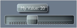 Creates a horizontal or a vertical (when 'vertical' property is set to true) slider widget. When the slider's knob is tapped and dragged, a bubble appears, showing the slider's current value. You can customize the bubble text by passing a function called 'textFormatter' along with the slider properties. This function will then receive the slider's current value (whenever changed). You can then format this value to any string you like and return the new value, which will be displayed as the bubble text then.
If you pass a function named 'onChange', this function will also be called on each slider change and receive an EventData object that contains some useful data (see below).
-- REQUIRE THE LIBRARY
_G.GUI = require("widget_candy")

-- CREATE THE WIDGET
_G.GUI.NewSlider(
	{
	x             = "center",
	y             = "center",
	name          = "MyWidget",
	theme         = "MyTheme1",
	width         = 250,
	vertical      = false,
	minValue      = 1,
	maxValue      = 50,
	value         = 10,
	step          = 1,
	tickStep      = 2,  -- SET TO NIL OR < 2 TO HIDE TICKS
	textFormatter = function(value) return "My Value: "..value end,
	onChange      = function(EventData) print(EventData.value) end,
	[any other properties...]
	} )
PROPERTIES
| Properties |
| | Use the common widget properties as described under Widget Properties. Additionally, this widget provides the following properties: |
| value | (Number) Sets the initial or current value of the slider. |
| minValue | (Number) Specifies the minimum value of the slider. |
| maxValue | (Number) Specifies the maximum value of the slider. |
| reversed | (Boolean) If set to true, the slider's min and max values are swapped (f.e. maximum value on top of a vertical slider, instead on the bottom). |
| step | (Number) Specifies the step size of the slider (the amount the slider's knob moves). |
| tickStep | (Number) If you specify any number greater than 2, ticks will be shown below or next to the slider, where tickStep is used to define the spacing between the individual ticks. |
| hideBubble | (Boolean) If set to true, no text bubble is shown when being dragged. |
| alwaysShowBubble | (Boolean) If set to true, the text bubble is always shown, even when the slider is not touched or dragged. |
LISTENER FUNCTIONS
Along with the above properties, you can also pass some functions to be called on certain events. Those functions will receive a parameter that contains useful event data.
| Listener Functions |
| onPress | (function) If you define a function named 'onPress' with the widget's properties table, this function will be called when the user taps the widget or when a drag event begins. Example:
onPress = function( EventData ) [ YOUR CODE HERE ] end, |
| onChange | (function) If you define a function named 'onChange' with the widget's properties table, this function will be called repeatedly while the user drags the slider's knob. This function will retrieve an EventData object. Read the EventData.value property to get the current slider value then. Example:
onChange = function( EventData ) print(EventData.value) end, |
| onRelease | (function) If you define a function named 'onRelease' with the widget's properties table, this function will be called when the user lifts the finger from the window or if a drag event ended. Read the EventData.inside property to find out if the finger was lifted inside or outside of the widget. Example:
onRelease = function( EventData ) [ YOUR CODE HERE ] end, |
| textFormatter | (function) If you define a function named 'textFormatter', this function will receive the value when changed. You can format this value to any string you like and return it to let the slider's bubble display the formatted value. Example:
textFormatter = function( value ) return "My value: "..value end, |
| EventData | (Table) Your onPress and onRelease functions will receive a table that contains useful event data. This table contains the following data:
- EventData.Widget - The widget's display object handle.
- EventData.Props - A table that contains all the widget's properties.
- EventData.name - The name of the widget (a string).
- EventData.inside - True if finger was released inside the widget or false.
- EventData.value - The current value of the slider.
- EventData.eventName - The event's name.
- EventData.eventID - The event's id.
|
|
|
| | | |
| |
.NewList() |
|
| |
 Lists are very handy to display arrays or lists of tables. A list can be populated with either an array of simple text strings or an array of tables, where you can define some properties for each table to determine the look of each list item (left icon, right icon, text color, background color etc.).
Lists provide an "edit" mode to allow the user to delete individual items. Edit mode can be activated either programmatically ( by using MyList:editMode(true) ) or by swiping over the list from the left to the right, if the List's .allowDelete property is set to true.
You can swap the list to be displayed by calling a list's :setList( ) method. This will replace the currently displayed list with another one (see widget's methods below).
Before you create a list, you should create an array of list items. This can be done in two ways:
As with all widgets, you can specify sound effects to be played when certain widget events occur. If you want to play a sound effect once a list item has been selected, use the selectSound property and specify a sound ID -see Widget Properties.
If you do not specify the 'caption' property, no title bar is shown.
You can also use custom images to be displayed with each item instead of icons from the icon sheet. To do so, add a property named .image to a list data item and specify an image file name (string) of an image to be loaded. Note that this feature could perform slowly on certain devices, especially with Android devices. The images used should be kept square sized and as small as possible to reduce load times. Specify a property named .imageSize for each list item to define the size of the custom image.
The list widget can be scrolled programmatically by using the two methods MyList:scrollBy(numberOfItems) or MyList:scrollTo(itemNumber). See method list below for details.
-- CREATE A LIST ITEM ARRAY, METHOD 1:
local ListData2 =
	{
	   parentList = ListData1, -- DISPLAY THE LIST'S BACK BUTTON
	   { iconL = 19, caption = "I am Item 1", anyData = "foo" },
	   { iconL = 19, caption = "I am Item 2", anyData = 1234 },
	   { iconL = 19, caption = "I am Item 3", anyData = false },
	}

-- OR LIKE THIS (TO ADD ITEMS AT ANY POSITION):
local ListData = {}
table.insert(ListData, 3, { iconL = 19, caption = "Hello"})
table.insert(ListData, 1, { iconL = 19, caption = "Hello"})
table.insert(ListData, 1, { iconL = 19, caption = "Hello"})
Note the list item 'parentList' in the code example above. If you provide this, the back button of the list widget is displayed. When tapped, the list will switch to the list you specify here as the 'parentList'.
Each list item can either be a simple string or a table that contains any data or properties. Each table item in your list item array may contain any number and kind of data, but you can use the following properties to specify the look and behaviour for each list item:
USING CUSTOM DISPLAY OBJECTS AS LIST ITEMS
With Widget Candy version 1.0.95 and above, you can also use custom display object groups containing any custom shapes, text- or image objects as list items instead of standard list items. This allows you to add any number of images, texts, shapes to list items. To do so, use .NewCustomList() instead of .NewList() and define a table of display groups to be used as the list's items. The implementation is pretty straightforward (also see included sample "sample_list_custom_items.lua"). Usage is the same as with .NewList(), the only exception is that you don't specify a .caption property for each list item, but a .content property that holds the reference to a custom display group object you created before. These display groups are then displayed as list items. Note, that custom list items are always limited to a uniform height of 40 pixels. Also be sure to remove those custom items from memory again when purging your list.
| List Item Properties |
| caption | (String) Any text to be displayed as the item's caption (when .NewList is used). Use a line break (\n) to span text over multiple lines (use the list widget's .itemHeight property to adjust the height of the list items if you want to display more than a single line of text). |
| content | (Display Group) Reference to a display object group to be displayed as item (when .NewCustomList is used -the .caption property will be ignored then). |
| iconL | (Number) Item's left icon (frame number on icon sheet). Set this to 0 to display no icon. |
| iconR | (Number) Item's left icon (frame number on icon sheet). Set this to 0 to display no icon. |
| textColor | (Array) Array of three values (red, green, blue) to specify the item's text color (Example: textColor = {1,.5,0}). |
| bgColor | (Array) Array of three values (red, green, blue) to specify the item's background color (Example: bgColor = {1,.5,0}). |
| selectable | (Boolean) If set to true, this item can be selected by the user, otherwise it will not be interactive. |
| deletable | (Boolean) If set to true, this item can be deleted by the user in edit mode, otherwise it will be removable programmatically only. |
| image | (String) File name of a custom image file to load and display with this list item. The image should be square sized and kept as small as possible (f.e. 32x32 pixels) to reduce load times. Note that using custom images results in slower performance than using icon sheet icons. |
| imageFilter | (Boolean) Gideros only. If a custom image is used, set this property to true to enable anti-aliasing for this image (default), false to disable filtering. |
| imageOptions | (Table) Gideros only. If a custom image is used, specify texture options for the custom image here. Example: imageOptions = {wrap = Texture.REPEAT, transparentColor = 0xff00ff} |
| imageSize | (Number) Size of the custom image file to be displayed with this list item. If not specified, the theme's default icon size is used. |
| baseDir | (String) Base directory of the image file to load and display with this list item. Possible values are system.ResourceDirectory, system.DocumentsDirectory etc. Default is your app's resource directory (where your main.lua resides). |
When you populated your list array, create a list and assign your array to it. You can also define a listener function named onSelect to be called whenever a list item is tapped. This function then receives useful data (index of item tapped, reference to the item itself etc.):
-- REQUIRE THE LIBRARY (ONCE)
_G.GUI = require("widget_candy")

-- CREATE THE WIDGET
_G.GUI.NewList(
	{
	x             = "center",
	y             = "center",
	name          = "MyWidget",
	theme         = "MyTheme1",
	width         = 250,
	height        = "80%",
	list          = ListData,
	allowDelete   = true,
	readyCaption  = "Quit Editing",
	scrollbar     = "onScroll",
	onSelect      = function(EventData) print("ITEM SELECTED!") end
	[any other properties...]
	} )
PROPERTIES
| Properties |
| | Use the common widget properties as described under Widget Properties. Additionally, this widget provides the following properties: |
| list | (Array) Array of either simple strings or tables to fill the list (see explanation above). |
| allowDelete | (Boolean) If set to true, the list will change to edit mode when the user swipes over the list (from the left to right). You can also use the MyList:editMode() method to switch edit mode on or off. |
| readyCaption | (String) While in edit mode, a button appears at the bottom of the list to exit the edit mode again. This property specifies the text caption of this button. |
| itemHeight | (Number) You can optionally specify a custom height for your list items. Default size is 40 pixels. |
| caption | (String) The title bar caption of the list. If not specified (nil or empty string), no title bar is shown at all. |
| noSlide | (Boolean) If set to true, no slide animation occurs when changing from one list to another (:setList). If not specified or false, animation is enabled. |
| scrollbar | (string) Specifies if a scrollbar indicator is shown. If not specified (nil) or set to "never", no scrollbar is shown. If set to "onScroll", the scroll indicator is shown while the list is dragged. Use "always" to show the indicator constantly. Note: the scrollbar is automatically hidden while a list is too short to be scrollable. |
| scrollbarAlpha | (Number) Specifies the transparency of the scroll indicator's bar. Use a value between 0 (transparent) and 1 (opaque). |
| slideOut | (Number) Specify a value here from 0 to .99 to set the list's slide-out speed (the slow-down applied when the list was dragged and then released). Use values from 0 (stop immediately) to .99 (slow slide out). |
| noScroll | (Boolean) If specified and set to true, the list will be 'locked' (user can't scroll the list then). To enable user-scrolling again, set this property to nil or true. |
LISTENER FUNCTIONS
Along with the above properties, you can also pass some functions to be called on certain events. Those functions will receive a parameter that contains useful event data.
| Listener Functions |
| onPress | (function) If you define a function named 'onPress' with the widget's properties table, this function will be called when the user taps the widget or when a drag event begins. Example:
onPress = function( EventData ) [ YOUR CODE HERE ] end, |
| onRelease | (function) If you define a function named 'onRelease' with the widget's properties table, this function will be called when the user lifts the finger from the window or if a drag event ended. Read the EventData.inside property to find out if the finger was lifted inside or outside of the widget. Example:
onRelease = function( EventData ) [ YOUR CODE HERE ] end, |
| onSelect | (function) If you define a function named 'onSelect', this function will be called whenever a list item was tapped (selected). - The .selectedIndex property of the received EventData table contains the array index number of the selected item then. - The .Item property of the received EventData table contains the selected list item table object. |
| onItemRemove | (function) If you define a function named 'onItemRemove', this function will be called whenever a list item is deleted by the user (by tapping on an item's delete icon). - The .pos property of the received EventData table then contains the index number of the deleted list item. |
| onItemRemoveRequest | (function) If you define a function named 'onItemRemoveRequest', list items are not deleted when a user taps on their delete icons. Instead, this function is called (the index number of the list item is passed with EventData) and therefore you can either chose to delete the item manually -or not. Use it to show a confirmation box, for example and delete the item when the user taps the okay button. |
| onBackButton | (function) If you define a function named 'onBackButton', this function will be called when the list's back button was pressed (switching from a list to a previous one). |
| onIconPress | (function) If you define a function named 'onIconPress', this function will be called when a list item's icon was pressed. Read the EventData.selectedIndex property to find out what item was pressed. |
| onIconPressR | (function) If you define a function named 'onIconPressR', this function will be called when a list item's iconR (icon on the right side) was pressed. Read the EventData.selectedIndex property to find out what item was pressed. |
| EventData | (Table) Your onPress, onRelease and onSelect functions will receive a table that contains useful event data. This table contains the following data:
- EventData.Widget - The widget's display object handle.
- EventData.Props - A table that contains all the widget's properties.
- EventData.name - The name of the widget (a string).
- EventData.inside - True if finger was released inside the widget or false.
- EventData.selectedIndex - (available only with onSelect event). The array index of the selected item (when tapped).
- EventData.Item - (available only with onSelect event). A reference to the selected list item table object.
- EventData.List - (available with onSelect and onItemRemove event). A reference to the current item array (list) attached to the list widget. Use EventData.List [ EventData.selectedIndex ] to access the tapped list item directly, for example.
- EventData.pos - (available only with onItemRemove & onItemRemoveRequest events). The index number of the list item that has been removed.
- EventData.eventName - The event's name.
- EventData.eventID - The event's id.
|
METHODS
Along with the common widget methods, this widget provides the following additional methods:
| MyList:setIndex ( index ) |
| Use this method to programmatically select a list item. |
| index | (Number) The array index of the item to select (1 to ...). Pass 0 to de-select all items. |
| MyList:getIndex ( ) |
| Use this method to programmatically select a list item. |
| Returns: | (Number) Number of currently selected list item (starting from 1, returns 0 if no item is selected). |
| MyList:setList ( List, slideDirection ) |
| Use this method to swap the current data list to display. The new list will slide in with a short animation (note: slide animation can be disabled by setting the list's noSlide property to true). |
| List | (Array) Array of simple strings or table objects to populate the list. |
| slideDirection | (String) Use "left" or "right" to let the new list either slide in from the left or right. |
| MyList:getCurrList ( ) |
| Use this method to get a reference to the current data list to display. |
| Returns | (Array) Returns a reference to the list's current array. |
| MyList:deleteItem ( List, pos, animate ) |
| Safely removes an item from the specified list array and updates the list widget to display the changes made. |
| List | (Array) Reference to a list array. |
| pos | (Number) Position of the item to delete (starting from 1). |
| animate | (Boolean) If false (default), the specified list item is removed instantly. If true, all list items below the specified item will smoothly shift up to give visual feedback of the deletion process, then delete the specified item after a short delay. Note: you should not use animation when removing multiple items. Use it when removing a single item only. |
| MyList:editMode ( true|false ) |
| Use this method to set edit mode on (true) or off (false). While in edit mode, a delete icon is shown next to each list item which can be tapped to remove the item. |
| MyList:scrollTo ( itemNumber ) |
| Scrolls the list to show a specified item. MyList:scrollTo(1) jumps right to the top of the list, showing the first item, for example. |
| MyList:scrollBy ( numberOfItems ) |
| Scrolls the list up or down by a specified amount of items. MyList:scrollBy(1) moves (scrolls) the list up by one item, MyList:scrollBy(-1) moves the list down by one item, for example. |
|
|
| | | |
| |
.NewImage() |
|
| |
 Adds any image, shape or display group you specify that can be used like a GUI object, for example added to a window. Image objects can receive onPress, onRelease and onDrag events (if you defined the appropriate listener functions). As with all widgets, you can also apply a border or a drop shadow by specifying the border property when creating the image or tinting the image using the color property (see common widget properties).
The added image will be scaled to the widget's width and height, regardless of the image's original size. If the widget is removed (using the widget's :destroy() method) you can specify wether the loaded image object should be deleted as well or not. If not, the image will be unparented and inserted into the main stage. However, it won't be a GUI object anymore and lose all GUI functionality.
Note that this command, unlike other widget creation commands, receives TWO parameters: a display object handle of an image as the first one and a properties table, as usual.
Use the widget's :setImage() method to replace the attached image by another one (use the :setImage method in conjunction with the onPress / onRelease listeners to create your own buttons, for example).
-- REQUIRE THE LIBRARY
_G.GUI = require("widget_candy")

_G.GUI.NewImage( display.newImage("image.png"),
	{
	x               = "center",
	y               = "center",
	width           = 160,
	height          = 160,
	name            = "IMG_SAMPLE",
	parentGroup     = nil,
	border          = {"inset",4,1, .7,1,.7,.25},
	onPress         = function(EventData) print("IMAGE PRESSED!")  end,
	onRelease       = function(EventData) print("IMAGE RELEASED!") end,
	onDrag          = function(EventData) print("IMAGE DRAGGING!") end,
	} )
PROPERTIES
| Properties |
| | Use the common widget properties as described under Widget Properties. There are no additional properties for this widget. |
LISTENER FUNCTIONS
Along with the above properties, you can also pass some functions to be called on certain events. Those functions will receive a parameter that contains useful event data.
| Listener Functions |
| onPress | (function) If you define a function named 'onPress' with the widget's properties table, this function will be called when the user taps the widget or when a drag event begins. Example:
onPress = function( EventData ) [ YOUR CODE HERE ] end, |
| onDrag | (function) If you define a function named 'onDrag' with the widget's properties table, this function will be called when the user drags the window around. Example:
onDrag = function(EventData) [ YOUR CODE HERE ] end, |
| onRelease | (function) If you define a function named 'onRelease' with the widget's properties table, this function will be called when the user lifts the finger from the window or if a drag event ended. Read the EventData.inside property to find out if the finger was lifted inside or outside of the widget. Example:
onRelease = function( EventData ) [ YOUR CODE HERE ] end, |
| EventData | (Table) Your onPress and onRelease functions will receive a table that contains useful event data. This table contains the following data:
- EventData.Widget - The widget's display object handle.
- EventData.Props - A table that contains all the widget's properties.
- EventData.name - The name of the widget (a string).
- EventData.inside - True if the user lifted the finger inside the widget (released inside), false if the finger was lifted outside the widget (released outside). To be used in your onRelease listener function.
- EventData.eventName - The event's name.
- EventData.eventID - The event's id.
|
METHODS
Along with the common widget methods, this widget provides the following additional methods:
| MyImageWidget:setImage (ImageHandle, true | false) |
| Replaces the attached image by another one (which can be used on conjunction with the onPress and onRelease listener functions to create your own buttons, for example. The second parameter (true or false) specifies if you want to keep the loaded image (true) or not (false, which is the default). If you pass 'true' to keep the image, it will be unparented and inserted to the main stage. However, it won't be a GUI object anymore and lose all GUI functionalities. |
| MyImageWidget:getImage () |
| Returns a reference to the currently attached image object or group. Do not forget to set all references to this object to nil when you remove the Image Widget or when replacing the attached graphic to ensure proper garbage collection. |
| MyImageWidget:destroy (true | false) |
| Removes the widget, as usual, except that you can specify if you want to keep the loaded image (true) or not (false, which is the default). If you pass 'true' to keep the image, it will be unparented and inserted to the main stage. However, it won't be a GUI object anymore and lose all GUI functionalities. |
|
|
| | | |
| |
.Confirm() |
|
| |
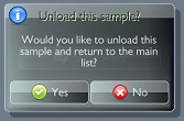 The Confirm() command creates an alertbox or confirmation dialog with one or more buttons. You can define the window icon, window title bar caption, text and buttons to be displayed.
If the modal property is set to true, the dialog box will block all touch events, so the user is forced to close the dialog box to be able to continue or use any widgets behind.
The buttons are defined by an array named buttons (see sample code below) where each array item must contain a button's caption and it's icon. You can define listener functions named onPress and onRelease with your alert box, which are called whenever a button is tapped or released. This listener functions receive an event data object that also tells you what button number was tapped.
You can specify an exact height property for the window, if no height property is specified, the window's height will be set to 'auto' by default which means that Widget Candy will try to calculate the height of this window automatically.
You do not need to specify a name for confirmation windows, but you can do so if you need to be able to close the confirmation programmatically using _G.GetHandle("MyAlertWindowName"):destroy() or :close() (using the :close method allows you to define an onClose listener function that is called when you remove the confirmation window programmatically, by the way).
If you need to send any custom data to the confirmation window, use it's .customData property, as explained below.
Note: if the window's height is set to "auto", the confirmation buttons are placed directly below the window text. If you specify an absolute window height (f.e. height = 250), the buttons are placed at the window's bottom. This could be useful if you want to place images etc. between the text and the buttons.
-- REQUIRE THE LIBRARY
_G.GUI = require("widget_candy")

-- SHOW CONFIRMATION DIALOG
_G.GUI.Confirm(
	{
	name      = "WIN_ALERT1",
	modal     = true,
	theme     = "theme_1",
	width     = "50%",
	icon      = 14,
	title     = "Abort game?",
	caption   = "Would you like to abort this game?",
	onPress   = function(EventData) print("Button pressed: "..EventData.button) end,
	onRelease = function(EventData) print("Button pressed: "..EventData.button) end,
	buttons   =
		{
			{icon = 15, caption = "Yes"},
			{icon = 16, caption = "No" },
		},
	} )
PROPERTIES
| Properties |
| | Use the common widget properties as described under Widget Properties. Additionally, this widget provides the following properties: |
| customData | (Table) If you need to pass some custom data to the confirmation window, specify a table named .customData and add any values to it. If the user presses one of the buttons, an event object is sent to your onPress and onRelease listener functions, which also contains the .customData table then (EventData.customData). |
| modal | (Boolean) If set to true, the dialog box blocks all touch events, forcing the user to interact with the dialog box in order to continue. |
| title | (String) The dialog box window's title caption. |
| caption | (String) The info text shown inside of the dialog window. |
| buttons | (Array) Array of table items, where each item defines a button. See button properties below. |
| Button Properties |
| | For each button in the buttons array, you can define the following properties: |
| icon | (Number) The icon to be displayed (number of the icon as placed on the theme's icon sheet). Use 0 (zero) to display no icon at all. |
| caption | (String) The button's text. |
| width | (Number or percent) Optional -the button's width. Can be an absolute number or a percentage string (f.e. "100%"). If no width is specified, it is calculated automatically. |
| newLine | (Boolean) Optional, default is false. If true, this button will be placed on a new line, below the previous button. |
LISTENER FUNCTIONS
Along with the above properties, you can also pass some functions to be called on certain events:
| Listener Functions |
| onPress | (function) If you define a function named 'onPress' with the alert box' properties table, this function will be called when the user taps a button. Example:
onPress = function(EventData) [ YOUR CODE HERE ] end, |
| onRelease | (function) If you define a function named 'onRelease' with the alert box' properties table, this function will be called when the user lifts the finger from a button. Example:
onRelease = function(EventData) [ YOUR CODE HERE ] end, |
| EventData | (Table) Your defined functions will receive a table that contains useful event data. This table contains the following data:
- EventData.Widget - The widget's display object handle.
- EventData.Props - A table that contains all the widget's properties.
- EventData.name - The name of the widget (a string).
- EventData.button - The number of the tapped button. If you defined two buttons, for example, the first button will be the number 1, the second button the number 2 and so on.
- EventData.customData - A table containing any custom data you specified (see properties above).
|
METHODS
Along with the common widget methods, this widget provides the following additional methods:
| MyDialogBox:destroy () |
| Removes the dialog box programmatically. |
|
|
| | | |
| |
.NewIconBar() |
|
| |
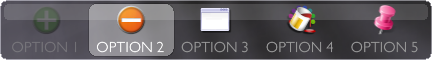
Creates an icon bar (similar to a tab bar), showing a specified set of touchable icons (either taken from the theme's icon sheet or custom images) and text labels. When tapped, an icon will be highlighted by a marker until another icon is tapped. An icon bar can be used as a tab bar.
You can either define an icon frame number for each item (to display the corresponding icon from the theme's icon sheet) or specify a file name (string) of a custom image file to display instead.
Icons, as well as their text labels can be placed either on top, center or bottom of the bar (or, with a vertical bar, at the left, center or right). You can define a text color for the item labels and an active text color (used when an icon is selected).
You can define the bar's background color and alpha, border color and alpha, as well as the border and background alpha of the icon marker. Each icon can set to be "disabled". Disabled icons are shown greyed out and do not respond to touch events.
To create a horizontal bar, simply specify a widget width greater than the widget's height. Otherwise, to create a vertical bar, specify a height greater than the widget's width.
Note: it is not recommended to change the icons array of an icon bar from within the onPress listener function. This may produce unwanted side effects. Use the onRelease listener function instead.
To add icons to your icon bar, use the widget's .icon property when creating your widget and pass a table that defines your bar items.
| Icon Properties |
| icon | (number) Frame number of the icon from the theme's icon texture sheet (starting from 1). If you specify 0 as the icon number, no icon is shown. |
| image | (String) Path and filename of an image file to be display instead of an icon. |
| imageFilter | (Boolean) Gideros only. If a custom image is used, set this property to true to enable anti-aliasing for this image (default), false to disable filtering. |
| imageOptions | (Table) Gideros only. If a custom image is used, specify texture options for the custom image here. Example: imageOptions = {wrap = Texture.REPEAT, transparentColor = 0xff00ff} |
| baseDir | (String) Base directory of the image file to load and display with this list item. Possible values are system.ResourceDirectory, system.DocumentsDirectory etc. Default is your app's resource directory (where your main.lua resides). |
| text | (String) The item's text label. If not specified, no text label is shown. |
| flipX | (Boolean) Flips the icon horizontally when true. |
| flipY | (Boolean) Flips the icon vertically when true. |
| disabled | (Boolean) If set to true, this item is disabled (greyed-out and non-interactive). |
-- REQUIRE THE LIBRARY
_G.GUI = require("widget_candy")

-- CREATE THE WIDGET
_G.GUI.NewIconBar(
	{
	x               = "center",
	y               = "bottom",
	width           = "100%",
	height          = 40,
	name            = "MyHorizontalBar",
	theme           = "MyTheme1",
	border          = {"normal",6,1, .07,.07,0,.4,  .3,.3,.3,.6},
	marker          = {8,1, 1,1,1,.5,  0,0,0,.25},
	iconSize        = 32,
	fontSize        = 17,
	textColor       = {.6,.6,.6},
	textColorActive = {1,1,1},
	textAlign       = "bottom",
	iconAlign       = "top",
	icons =
		{
			{icon  = 7, text = "OPTION 1", disabled = true},
			{icon  = 8, text = "OPTION 2"},
			{image = "custom_image.png", text = "OPTION 3"},
		},
	onPress = function( EventData )
			print("ICON No. "..EventData.selectedIcon.." PRESSED!")
	end,
	[any other properties...]
	} )
PROPERTIES
| Properties |
| | Use the common widget properties as described under Widget Properties. Additionally, this widget provides the following properties: |
| border | (Array) Specifies the background appearance (fill color, stroke color, alpha, rounded corner radius etc.). See Widget Properties, "border" property for details. |
| marker | (Array) Specifies the fill and stroke color of the icon marker. Pass an array like this: marker = {corner radius, stroke width, fillColorR,fillColorG,fillColorB,fillAlpha, strokeColorR,strokeColorG,strokeColorB,strokeAlpha } |
| iconSize | (Number) Specifies the size of the icons. If not specified, the icon size is determined automatically by the icon bar's width or height. |
| icons | (Table) A table that contains one or more items to define what icons (or custom images) are displayed and wether they are disabled or not. Each table item may contain the following properties: .icon - Icon frame number on the theme's icon sheet
.image - File name of a custom image file
.imageFilter - true (anti-alias image) or false.baseDir - Base dir of the custom image
.disabled - Item is disabled (true) or not (false)
.flipX - Flips the icon (or image) horizontally when set to true
.flipY - Flips the icon (or image) vertically when set to true |
| glossy | (0...1) The strength of the bar's glossy effect (the bright rectangle on the bar's top or left). As higher the value, as more visible it is. Use 0 to disable this effect. If not specified (nil), a default value of 32 is used. |
| fontSize | (Number) Font size of the item text labels. If not specified, the theme's default font size is used. |
| textColor | ( {R,G,B} ) Array of three values from 0 to 1 that define the RGB color of the items' text. If not specified, the theme's default font color is used. |
| textColorActive | ( {R,G,B} ) Array of three values from 0 to 1 that define the RGB color of selected (active) item texts. If not specified, the theme's default font color is used. |
| textAlign | (String) Defines the position of the items' text label. Can be "top", "center" or "bottom" for horizontal bars and "left", "center" or "right" for vertical bars. |
| iconAlign | (String) Defines the position of the items' icon or image. Can be "top", "center" or "bottom" for horizontal bars and "left", "center" or "right" for vertical bars. |
LISTENER FUNCTIONS
Along with the above properties, you can also pass some functions to be called on certain events. Those functions will receive a parameter that contains useful event data.
| Listener Functions |
| onPress | (function) If you define a function named 'onPress' with the widget's properties table, this function will be called when the user taps the widget. Example:
onPress = function( EventData ) [ YOUR CODE HERE ] end, |
| onRelease | (function) If you define a function named 'onRelease' with the widget's properties table, this function will be called when the user lifts the finger from the widget. Example:
onRelease = function( EventData ) [ YOUR CODE HERE ] end, |
| EventData | (Table) Your onPress and onRelease functions will receive a table that contains useful event data. This table contains the following data:
- EventData.Widget - The widget's display object handle.
- EventData.Props - A table that contains all the widget's properties.
- EventData.name - The name of the widget (a string).
- EventData.inside - True if the user lifted the finger inside the widget (released inside), false if the finger was lifted outside the widget (released outside). To be used in your onRelease listener function.
- EventData.selectedIcon - The number of the selected icon (starting from 1). If this value is zero, no icon (or a disabled icon) was touched.
- EventData.eventName - The event's name.
- EventData.eventID - The event's id.
|
METHODS
Along with the common widget methods, this widget provides the following additional methods:
| MyIconBar:setMarker (index, animated) |
| Highlights the specified icon. Use an index of 1 to show the first icon selected, 2 for the second icon and so on. Pass 0 (zero) to remove the marker and select no icon at all. If the second parameter (animated) is specified and set to true, the marker will move smoothly from its current position to the specified one. |
| MyIconBar:updateIcon (index, Values) |
| Use this method to update a certain icon. Index is the number of the icon on the bar (1 to ...) and Values a table that contains the new properties of the icon to be changed. Example: MyBar:updateIcon(1, {icon = 22, text = "Some text", disabled = true} ) |
|
|
| | | |
| |
.NewCalendar() |
|
| |
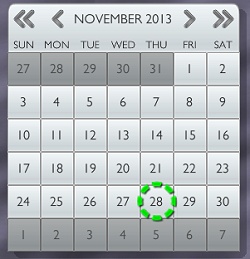
Creates a calendar widget to choose a date. When tapped, the widget's onPress and onRelease event listener functions are called wich receive a table that contains useful information, as the picked date (if the user tapped a day button) or a button identifier string if the user tapped one of the navigation buttons on the widget's top.
At creation time, the calendar widgets displays the current date by default. You can specify any date to show by using the widget's .day, .month and .year property at creation time. You can set or retrieve the displayed date at any time using the widget's :setDate() and :getDate methods.
The default text color of the calendar widget is specified by the .CalendarTextColor property in your theme's lua file, but you can also specify an individual text and marker color using the widget properties explained below.
The month and day names are english by default, you can localize the names using the .monthNames and .dayNames properties. First day of the week is sunday by default. Set the widget property .startMonday to true to specify monday as first day of the week.
Note that the calendar widget has a fixed size (7x7.5 tiles), therefore the .width and .height properties are ignored.
You can specify a custom background color, a custom text color and an icon to be displayed for any certain day using the calendar's :setDayInfo() method.
-- REQUIRE THE LIBRARY
_G.GUI = require("widget_candy")

-- CREATE THE WIDGET
_G.GUI.NewCalendar(
	{
	x               = "center",
	y               = "center",
	scale           = 1.0,
	name            = "MY_CALENDAR",
	parentGroup     = nil,
	theme           = "theme_1",
	border          = {"shadow", 8,8, .5},

	-- OPTIONAL: CUSTOM COLORS
	markerColor     = {0,1,0, 1},
	dayNamesColor   = {1,1,0, 1},
	monthYearColor  = {1,1,0, 1},
	textColor       = {1,1,0, 1},

	-- OPTIONAL: SHOW A CERTAIN DATE
	day             = 25,
	month           = 1,
	year            = 2013,

	onRelease       = function(EventData)
			local button = EventData.buttonPressed
			local day    = EventData.day
			local month  = EventData.month
			local year   = EventData.year
			print("BUTTON PRESSED: "..button)
		end,
	} )
PROPERTIES
| Properties |
| | Use the common widget properties as described under Widget Properties. Additionally, this widget provides the following properties: |
| markerColor | (Array) Specifies the marker color (red, green, blue and alpha), each value may range from 0.0 to 1.0 |
| dayNamesColor | (Array) Specifies the color of the day names (red, green, blue and alpha), each value may range from 0.0 to 1.0 |
| monthYearColor | (Array) Specifies the color of the month and year caption on the top of the widget (red, green, blue and alpha), each value may range from 0.0 to 1.0 |
| textColor | (Array) Overrides the default widget text color with a custom color (red, green, blue and alpha), each value may range from 0.0 to 1.0 |
| day | (Number) The day to be displayed on creation time (1-31). If not specified, the current date is used. |
| month | (Number) The month to be displayed on creation time (1-12). If not specified, the current date is used. |
| year | (Number) The year to be displayed on creation time (f.e. 2013). If not specified, the current date is used. |
| dayNames | (String Array) Optional array of seven day names to be used instead of the default ones. The array starts with Sunday. Example monthNames = {"Sunday", "Monday", ... "Saturday"} |
| monthNames | (String Array) Optional array of twelve month names to be used instead of the default ones. The array starts with January. Example monthNames = {"JAN", "FEB", "MAR" ... "DEC"} |
| startMonday | (Boolean) If set to true, monday is displayed as first day of the week instead of sunday. |
| highlightWeekend | (Boolean) If set to true, weekend days are highlighted with red color. |
LISTENER FUNCTIONS
Along with the above properties, you can also pass some functions to be called on certain events. Those functions will receive a parameter that contains useful event data.
| Listener Functions |
| onPress | (function) If you define a function named 'onPress' with the widget's properties table, this function will be called when the user taps the widget. Example:
onPress = function( EventData ) [ YOUR CODE HERE ] end, Note: to retrieve a date chosen by the user, you should use the onRelease event listener function. |
| onRelease | (function) If you define a function named 'onRelease' with the widget's properties table, this function will be called when the user lifts the finger from the widget. Example:
onRelease = function( EventData ) [ YOUR CODE HERE ] end, |
| EventData | (Table) Your onPress and onRelease functions will receive a table that contains useful event data. This table contains the following data:
- EventData.Widget - The widget's display object handle.
- EventData.Props - A table that contains all the widget's properties.
- EventData.name - The name of the widget (a string).
- EventData.buttonPressed - A string that indicates what button was pressed:
"" (empty) - No button was pressed
"Y+" - The 'next year' button
"Y-" - The 'previous year' button
"M+" - The 'next month' button
"M-" - The 'previous month' button
"DAY" - A day number button
- EventData.day - Holds the number of the day tapped by the user (1-31).
- EventData.month - Holds the number of the currently displayed month (1-12).
- EventData.year - Holds the number of the currently displayed year.
- EventData.dayInfo - A table that contains the custom icon, bg color and text color of this day (if set with :setDayInfo before, otherwise table is nil)
|
METHODS
Along with the common widget methods, this widget provides the following additional methods:
| MyCalendar:setDate (day, month, year) |
| Sets the date to be displayed where day can range from 1-31 and month from 1-12. |
| MyCalendar:getDate () |
| Returns a table with the fields .day, .month and .year which is the currently displayed date of the widget. Example: local theDate = MyCalendar:getDate()
print("DAY: "..theDate.day)
print("MONTH: "..theDate.month)
print("YEAR"..theDate.year) |
| MyCalendar:setDayInfo (day, month, year, data) |
| Applies custom colors and an icon from the theme's icon sheet to a certain date where 'data' is a table which may contain the following properties: MyCalendar:setDayInfo( 31,12,2013, {icon = 14, bgColor = {0,1,0}, textColor = {1,0,0} ) To remove an icon or a color, simply pass nil (f.e. icon = nil). To remove all data for a certain day, pass nil instead of a table: MyCalendar:setDayInfo( 31,12,2013, nil ) All properties you set using :setDayInfo are passed to your onPress and onRelease event listener functions (EventData.dayInfo) |
|
|
| | | |
| |
.NewScrollView() |
|
| |

Creates a scroll view widget to display an image or a group of objects, showing only a certain part of the content. If .dragX or .dragY are set to true, the user can drag and scroll the content either vertically, horizontally or into both directions. Scroll views can be used to display smaller portions of a huge image, to display a collection of pictures or to display a set of choices and let the user scroll through them.
You can set the scroll view's .pagingMode property to true to enable page mode. Page mode requires that either the width or height of the content attached to the scroll view is a multiple of the width or height of the scroll view gadget. When the content is then dragged and scrolled by the user, it will automatically 'snap' at certain positions (pages) and tell you what page of the content is currently displayed.
Note: When attaching touchable items to the Scrollview, you should add a return true to your own touch listener function, which prevents the Scrollview from also using this touch event.
CONTENT SIZE
Generally, the content used should be bigger (or at least of the same width and height) than the scroll view gadget.
Horizontal paged scroller: To create a paged, horizontal scroller, the content's height should be equal to the scroll views height and the content's width must be a multiple of the scroll view's width. So if the scroll view is 300x200, your content should be sized 900x200 (= three pages to scroll), for example.
Vertical paged scroller: To create a paged, vertical scroller, the content's width should be equal to the scroll views width and the content's height must be a multiple of the scroll view's height. So if the scroll view is 300x200, your content should be sized 300x600 (= three pages to scroll), for example.
Gideros users: If you modified anything inside your scroll view's content (updated any texts etc.) you must call MyScrollView:update() afterwards to force the content to be redrawn. This is because the scroll view redraws the masked content only when needed (during a scroll event, for example) to save performance and battery life on the device.
-- REQUIRE THE LIBRARY
_G.GUI = require("widget_candy")

-- CREATE THE WIDGET
_G.GUI.NewScrollView(
	{
	x               = "center",
	y               = "center",
	width           = 260,
	height          = 260,
	scale           = 1.0,
	name            = "MY_SCROLLVIEW",
	parentGroup     = nil,
	theme           = "theme_1",

	margin          = 4,    -- MARGIN BETWEEN BORDER & CONTENT
	dragX           = true, -- ALLOW HORIZONTAL DRAGGING
	dragY           = false,-- ALLOW VERTICAL DRAGGING
	slideOut        = .4,   -- DRAG-RELEASE SLIDE OUT SPEED (0-.99)
	pagingMode      = true, -- SNAP TO CERTAIN PAGES
	currPage        = 1,    -- PAGE TO START WITH
	content         = Group,-- IMAGE OR GROUP OF OBJECTS
	border          = {"inset",4,1, 1,1,1 ,.25, 0,0,0, 1},

	onPress         = function(EventData) print("PRESSED!") end,
	onRelease       = function(EventData) print("RELEASED!") end,
	onDidScroll     = function(EventData)
			print("USER SCROLLED TO PAGE:"..EventData.currPage)
		  end
	} )
PROPERTIES
| Properties |
| | Use the common widget properties as described under Widget Properties. Additionally, this widget provides the following properties: |
| margin | (Number) Specifies the margin (spacing) between the scroll view's outer borders and the content. Since the scroll view itself has no graphical elements, you should define a border (see .border property under 'Common Widget Properties' above). Set the margin to 4 or 8 pixels then, otherwise the border would be hidden behind the scroll view's content. |
dragX
dragY | (Boolean) Allows the user to drag the content either in vertical, horizontal or both directions. |
| slideOut | (Number) Specify a value here from 0 to .99 to set the widgets's slide-out speed (the slow-down applied when the content was dragged and then released). Use values from 0 (stop immediately) to .99 (slow slide out). |
| pagingMode | (Boolean) If set to true, the content snaps to certain positions (pages) when dragged and released. Requires the content's width to be a multiple of the scroll view's width (for a horizontally scrolling view) or the content's height to be a multiple of the scroll view's height (for a vertically scrolling view). |
| currPage | (Number) If pagingMode is enabled, the scroll view automatically scrolls to the page you defined with currPage. |
| content | (Display Object) A valid display object (Image, shape or group of objects) to be displayed as the scroll view's content. |
scrollbarH
scrollbarV | ("never" | "always" | "onScroll") Displays vertical and horizontal scroll indicators. Values can be "hidden" (hide scroll indicator), "always" (always visible) or "onScroll" (shown during a scroll event only). |
| scrollbarAlpha | (Number) Transparency of the scrollbar indicator's background bar. |
LISTENER FUNCTIONS
Along with the above properties, you can also pass some functions to be called on certain events. Those functions will receive a parameter that contains useful event data.
| Listener Functions |
| onPress | (function) If you define a function named 'onPress' with the widget's properties table, this function will be called when the user taps the widget. Example:
onPress = function( EventData ) [ YOUR CODE HERE ] end, Note: to retrieve the current page in page mode, you should use the onDidScroll event listener function. |
| onRelease | (function) If you define a function named 'onRelease' with the widget's properties table, this function will be called when the user lifts the finger from the widget. Example:
onRelease = function( EventData ) [ YOUR CODE HERE ] end, |
| EventData | (Table) Your onPress and onRelease functions will receive a table that contains useful event data. This table contains the following data:
- EventData.Widget - The widget's display object handle.
- EventData.Props - A table that contains all the widget's properties.
- EventData.name - The name of the widget (a string).
- EventData.currPage - Number of currently displayed page (page mode only, use onDidScroll event then to retrieve current page)
- EventData.x - The event's global x-coordinate.
- EventData.y - The event's global y-coordinate.
- EventData.lx- The event's local x-coordinate.
- EventData.ly- The event's local y-coordinate.
- EventData.eventName - The event's name.
- EventData.eventID - The event's id.
|
METHODS
Along with the common widget methods, this widget provides the following additional methods:
| MyScrollView:setContent (imageOrGroup) |
| Changes the scroll view's content and displays the specified image or object group then. Any previous content will be removed from the scroll view. NOTE: Although if removed, the previous content could still remain in memory if you created any references to it before. To allow proper garbage collection, you should remove *any* references to the scroll view's previous content before! |
| MyScrollView:setPage (number) |
| Availabe in paged mode only. Sets the content page to be displayed (in page mode) and automatically scrolls to the specified page. |
| MyScrollView:positionContent (x,y) |
| Availabe in non-Paged mode only. Positions the scroll view's content at the specified position. |
| MyScrollView:moveContent (x,y) |
| Availabe in non-Paged mode only. Moves the scroll view's content by the specified values. |
| MyScrollView:placeContent (x,y) |
| Availabe in non-paged mode only. Positions the content percentually inside the scroll view, where x and y may be values of range 0.0-1.0 where 0 = left / top and 1 = right, bottom. |
| MyScrollView:update () |
| Gideros only. Redraws the content of the scroll view. Must be called when the content was changed (f.e. texts inside the content have been changed etc.). |
|
|
| | | |
| |
.NewInfoBubble() |
|
| |

Creates a tooltip like bubble that displays a given text and an optional icon. As with all widgets, you can set an individual text size (.fontSize property), text color (.textColor) and icon (.icon). You can apply any color using the .color property. Text alignment can be "left", "center", or "right".
An arrow can be shown to point onto another widget or something interesting on screen. Set the property .animation to true to animate the arrow, so it catches even more user attention. The arrow can be positioned on top of the bubble (to let it point upwards), on the left or right, to point to the side, or at bottom to point downwards.
If you set the info bubble's .width property to "auto", it's width will be automatically determinded by the width of the text to display. If you specify a fixed width, and the given text should exceed the info bubble's width, the text scrolls automatically marquee-like over it's entire length.
To position the info bubble to point on certain things on your screen, use it's :position() method, which accepts either x/y coordinates or a widget name. If you specify a widget name, the info bubble places itself automatically next to this widget to point on it. Use the .targetDistance property to control the distance between the info bubble and the target object.
If you want to display useful tooltips in your app, it would be enough to create a single info bubble, for example, and reposition it wherever you want it to be displayed. While not used, hide it using :show(false).
-- REQUIRE THE LIBRARY
_G.GUI = require("widget_candy")

-- CREATE THE WIDGET
_G.GUI.NewInfoBubble(
	{
		width           = 200,
		scale           = 1,
		name            = "MyTooltip1",
		parentGroup     = nil,
		theme           = "theme_1",
		caption         = "Some text!",
		icon            = 14,
		textAlign       = "center",
		fontSize        = 18,
		textColor       = {.2,.2,.2},
		color           = {1,1,1},
		showArrow       = true,
		position        = "top",
		animation       = true,
		bubbleAlpha     = 1.0,
		targetDistance  = 20,
		-- HIDE ON TAP
		onPress         = function(EventData)
			EventData.Widget:show(false, true)
		end,
	} )

	-- POSITIONS INFO BUBBLE TO POINT ON A BUTTON
	_G.GUI.GetHandle("MyTooltip1"):position("MyButton")
PROPERTIES
| Properties |
| | Use the common widget properties as described under Widget Properties. Additionally, this widget provides the following properties: |
| position | (String) Can be "bottom", "left", "right" or "top". "bottom" places the bubble below the target coordinate or target widget, "top" places the bubble above the target and so on. |
| showArrow | (Boolean) Set this property to true to display an arrow, false to have no arrow displayed. The arrow's viewing direction depends on what you specify for the .position property. If .position is set to "bottom" (bubble is positioned below a target) the arrow will point upwards, for example. |
| animation | (Boolean) Set this property to true to animate the arrow. |
| bubbleAlpha | (0...1) Specifies the transparency of the bubble. |
| targetDistance | (Number) Sets the distance / gap between the bubble's arrow and the target coordinate or target widget. |
color
fontSize
textAlign
caption | Also use these properties for customization. See common widget properties under "Widgets". |
LISTENER FUNCTIONS
Along with the above properties, you can also pass some functions to be called on certain events. Those functions will receive a parameter that contains useful event data.
| Listener Functions |
| onPress | (function) If you define a function named 'onPress' with the widget's properties table, this function will be called when the user taps the widget or when a drag event begins. Please note that a toggle button's toggleState will be updated with the onRelease event, not the onPress event, so use the onRelease event to ask for a toggle button's current state. Example:
onPress = function( EventData ) [ YOUR CODE HERE ] end, |
| onRelease | (function) If you define a function named 'onRelease' with the widget's properties table, this function will be called when the user lifts the finger from the window or if a drag event ended. Read the EventData.inside property to find out if the finger was lifted inside or outside of the widget. Example:
onRelease = function( EventData ) [ YOUR CODE HERE ] end, |
| EventData | (Table) Your onPress and onRelease functions will receive a table that contains useful event data. This table contains the following data:
- EventData.Widget - The widget's display object handle.
- EventData.Props - A table that contains all the widget's properties.
- EventData.name - The name of the widget (a string).
- EventData.inside - True if the user lifted the finger inside the widget (released inside), false if the finger was lifted outside the widget (released outside). To be used in your onRelease listener function.
|
METHODS
Along with the common widget methods, this widget provides the following additional methods:
| MyInfoBubble:position (x, y) |
| Positions the bubble to point to a certain x/y coordinate. |
| MyInfoBubble:position ("widgetName") |
| Positions the bubble to point to a widget. |
| MyInfoBubble:animate (true | false) |
| Pauses (false) or resumes (true) the info bubble's scrolling animation. |
|
|
| | | |
|
 Particle Candy