| |
TUTORIALS, HINTS & TRICKS |
|
| |
Here you find articles that cover frequently asked questions, as well as short tutorials, hints and tricks.
|
|
| | | |
| |
ALTERING THEMES |
|
| |
Creating a custom theme is quite easy. If you examine the different files of a theme, you'll find it very logical and self-explaining. Each theme consists of:
- A settings .lua file (placed in your project's root)
- A widget graphic sheet, icon graphic sheet and sound files (all placed in a folder with the same name as your theme)
 |
Settings File
In a theme's settings file you specify the default text colors for the widgets, the fonts used, font sizes etc. -most of these settings are independent from the actual graphic sheet used to draw the widgets and can be changed at any time, without changing the theme's graphic sheet. Take a look into the thoroughly commented default theme settings file shipped with Widget Candy, it's pretty much self-explaining.
|
 |
Sound Files
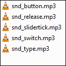
A theme's sound files (optional) are placed within a theme's folder, as with all other media that belong to this theme. If you want a widget to play a sound when tapped, released, changed etc., you must provide a list of your sound file names in your theme's settings file and specify a sound number when creating your widget then.
|
 |
Icon Sheet
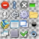
Each theme requires a graphic which holds all the icons you want to use with the regarding theme (button and list icons etc.). All these icons are placed on a single image, the icon sheet. This image sheet should be square sized and all icons on it of the same size (best choice: 32x32 pixels). To use these icons, just specify an icon number when creating a widget. Icons on the icon sheet are numbered from left to right, from to bottom.
|
 Theme Graphic Sheet
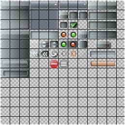
All widget graphics used by a theme (buttons, sliders, window parts etc.) are placed as frames on a single, square sized image sheet. Each Widget Candy control consists of several parts. A button, for example, is made of three images: the left cap, the right cap and the middle part. All these widget parts are placed as frames on a theme's graphic sheet, where all frames are of the same size (40x40 pixels minimum is recommended, smaller graphics will make it hard for the user to tap on the widgets).
Open a theme's image sheet (named "gfx_widgets.png" by default) with your favorite image editing tool or image viewer, enable the grid view (if provided) and set the grid size to 40 pixels. You'll see how widgets are put together using several parts. A window widget, for example, requires four corner images, four images for the top, left, right and bottom border and a background image. All widget parts are placed on the sheet in such a way that it is easy for you to determine how they are put together at runtime.
Creating Custom Skins
To create a custom skin, just take any existing skin and create a copy of it's setting file and it's media folder. Then all you need to do is to change the widget graphic sheet to your needs and to edit the theme's settings file. The most time consuming and creative part, of course, is to change the widget graphics image sheet. Once you are used to it, you'll find that you can create very unique and different looking skins.
The easiest way to edit a theme's graphic sheet is to open it in your image editing tool and enable the "grid view", if provided. Use a grid spacing of 40 pixels (beause each widget part frame is sized 40x40 pixels). This will display a grid on top of the image (as shown in the graphic above), which helps you to determine the different frames on the image sheet.
Using Custom Fonts
To add or change a font used with a theme,
- Place your font file in your project's root
- Edit your theme's settings .lua file and find the two entries WindowCaptionFont and WidgetFont. Just edit these lines and enter the name of your font here (the font name is NOT the font's file name. It's the font's title as shown when you open the font with the Windows or Mac OS font viewer. Please keep this difference in mind!).
- Also open your build.settings file and include the FILE name of your font there, as explained here.

|
|
| | | |
| |
UNIVERSAL BUILDS |
|
| |
If you are working on a universal build that targets multiple devices, you may find that your widgets may look "clumsy" on devices with a bigger screen. This is because SOLAR2D uses a virtual resolution inside your app (the resolution you defined in your config.lua) and stretches this resolution to fit the actual screen of the device.
To handle this situation, simply scale your widgets (by using their scale property). If your widgets are designed for iPhone, for example, you should scale them to 0.5 to achieve the same look on the iPad.
If your app targets more devices than iPad or iPhone and you really do not know what screen size the target device will have (think of Android devices, for example), simply do a check when your app starts up to find the actual (physical) screen size of the device:
local w = math.round( (display.contentWidth  - display.screenOriginX*2) / display.contentScaleX)
local h = math.round( (display.contentHeight - display.screenOriginY*2) / display.contentScaleY)
isTablet = false; if w >= 1024 or h >= 1024 then isTablet = true end
GUIScale = isTablet == true and .5 or 1.0
This code finds out the real (physical) resolution of the device your app is running on. Then we set a variable "GUIScale" to 0.5 if the screen width is bigger or equal 1024 pixels (which is most probably a tablet device then). This scale factor is applied for all widgets we create:
-- REQUIRE THE LIBRARY
_G.GUI = require("widget_candy")

-- CREATE A BUTTON
_G.GUI.NewButton(
	{
	x       = 0,
	y       = 0,
	width   = "50%",
	name    = "MyButton",
	theme   = "MyTheme1",
	icon    = 2,
	caption = "Touch me!",
	scale   = GUIScale,
	[any other properties...]
	} )
Note: You don't need to apply a special scaling for widgets that are placed within a window widget. Just scale the window itself instead. This is because widgets placed in a window "inherit" the scale factor of the window (as they also do when placed in a scaled display group, by the way).

|
|
| | | |
| |
USING SCENE MANAGERS |
|
| |
Using Widget Candy with Corona's Storyboard is very straightforward. Click on the link below to download an example project that demonstrates how to set up several scenes and how to switch from one scene to another:
When using a scene manager, keep the two rules in mind:
- First create a scene, THEN create your widgets.
- First remove your widgets, THEN switch to another scene.
You should never remove widgets manually using SOLAR2D's :removeSelf() or Gideros' :removeFromParent() methods. Use the widget's :destroy() method instead and let Widget Candy do this for you. This is because there is data associated with the widgets that also needs to be removed. When you remove your widgets manually (or if a scene manager tries to remove them) this data remains in memory and cannot be removed anymore.

|
|
| | | |
| |
DISABLING DEBUGGING MESSAGES |
|
| |
|
|
| | | |
|

 Particle Candy
 Widget Candy

 Theme Graphic Sheet